
· 2 min read
Darin Cassler

We're excited to announce that @prism2/tailwind-theme is now available as a pre-alpha. It provides an out-of-the-box way to incrementally adopt Prism design standards without writing any CSS or including anything you don't need.

We are using this same theme package to build the entire component library for Prism2. As we refine various aspects of Prism2, this package will adhere to the most up-to-date brand guidelines. Please keep in mind that this pre-release package is under active development and will change significantly. We are unable to offer support during the alpha period. Do not use for production. Use at your own risk.

We hope that by using this theme (once ready) teams can implement UIs with the look-and-feel of Prism2 across their apps without worrying about specific hex values or pixel counts; nor need to use specific library component (or eventually fork it to suit their needs).

One-step Setup

Prerequisite: You must configure your project to use Artifactory as the registry

pnpm add tailwindcss postcss autoprefixer \
@prism2/tailwind-theme && npx tailwindcss init && echo \
"module.exports = { plugins: { tailwindcss: {}, autoprefixer: {} } }" \
>> postcss.config.js

This should work for most React frameworks. See the Tailwind Framework Guides for more information on configuring certain setups.

Tell Tailwind to use the theme

//tailwind.config.js
module.exports = {
/** @type {import('tailwindcss').Config} */
module.exports = {
content: ["./src/**/*.{html,jsx,tsx}"],
theme: {
extend: require('@prism2/tailwind-theme'),
},
plugins: [],
}
}

· 2 min read
Darin Cassler

Hey folks,

Along with todays v1.33 release of Prism, we wanted to share some updates around our planning for the next major version of Prism. We'll be providing regular updates on our progress moving forward. In the meantime - you can explore a preview of Prism2 on the Github Repository or in our Storybook preview deployment.

Utility Over Convenience

First and foremost, we will be prioritizing utility over convenience moving forward. That means that we will focus on providing developers with a powerful, world-class experience which - critically - is only as opinionated as you ask it to be. In other words, there will always be an escape hatch or lower level module at your disposal when you need it.

TypeScript, Autocompletion & IDE Integrations

React Intellisense

Recently, we interviewed a number of you to gather feedback about the future of Prism. In those interviews, we consistently heard that developers keep the Prism docs website open in a tab all day for reference. We think that this could be easier. In fact, we are making it much easier.

With that said, we're glad to say that Prism2 is being written in Typescript. We are leaning hard into the developer experience by supporting things like Microsoft Intellisense to provide inline documentation and autocompletion across Prism2. All exported modules include extensive Docgen comments. This allows for Intellisense, autocompletion, inline-documentation, linting and validation right in your editor (VSCode).

Typescript declarations are the single most requested feature from the community and has been for quite some time. Migrating the existing codebase to Typescript would be a prohibitively time-intensive process. However, the greenfield of Prism2 allows us to be fully-typed from the start.

Storybook Docs & Prop Tables

Additionally, we use comments on our type declarations to generate documentation. This can be injected into tools such as Storybook. As a result, our documentation will always be up to date and will not need to be maintained separately. (Example commented code)

Storybook props

Tailwind CSS IntelliSense

Further, we tap into the Tailwind plugin ecosystem to provide autocompletion through Tailwind CSS IntelliSense (VSCode only)

Classname Intellisense

· One min read
Darin Cassler

New Features

  • Feature: Added new Range feature & Clear button to DatePicker US767988
  • Feature: Added styling to support the DatePicker with Range US768804
  • Preview: Now publishing a preview of @prism/legacy - our LTS target for PRISM 1.x with modern build tools.

Documentation

  • Added documentation for the new Date Range Picker feature US774000
  • Preview: A sneak-peak of the new PRISM docs can be found here

· 3 min read
Darin Cassler

Today we are rolling out the first in a series of steps that will help facilitate long-term support of PRISM 1.x and allow the team to pivot to working on 2.0. No action is required on your part -- yet. With our standard release cycle, we are now publishing @prism/legacy to Artifactory. This package is functionality identical to @prism/library with some significant under-the-hood changes that don't impact the published code. The legacy package will be co-published along on beta channels as we continue to the transition.

No action is required at this time. However, we are recommending that teams plan for the following:

What to expect:

  • Long-term support (LTS) will be provided - at a minimum - for @prism/library and @prism/styles.
  • Individual component packages such as @prism/button will stop receiving updates directly.
  • A preview of an LTS-specific bundle is now available in the @prism/legacy package. (Not ready for production)

How to prepare:

Do not use @prism/legacy as a dependency for your project in production at this time.

While technically no action is required at this time, teams will eventually need to opt-in to LTS in order to receive updates. We will share more details as they become available. In the interim, we encourage teams to make the changes above where appropriate. Additionally, consider declaring @prism/legacy as a dependency in your projects to confirm that everything remains consistent.

If you're using individual component packages

Swapping component dependencies for the full library is very simple. This process is intended to make the final transition to LTS as simple as possible. Repeat for any component that you want to use in your project:

// Individual component packages will no longer receive updates.
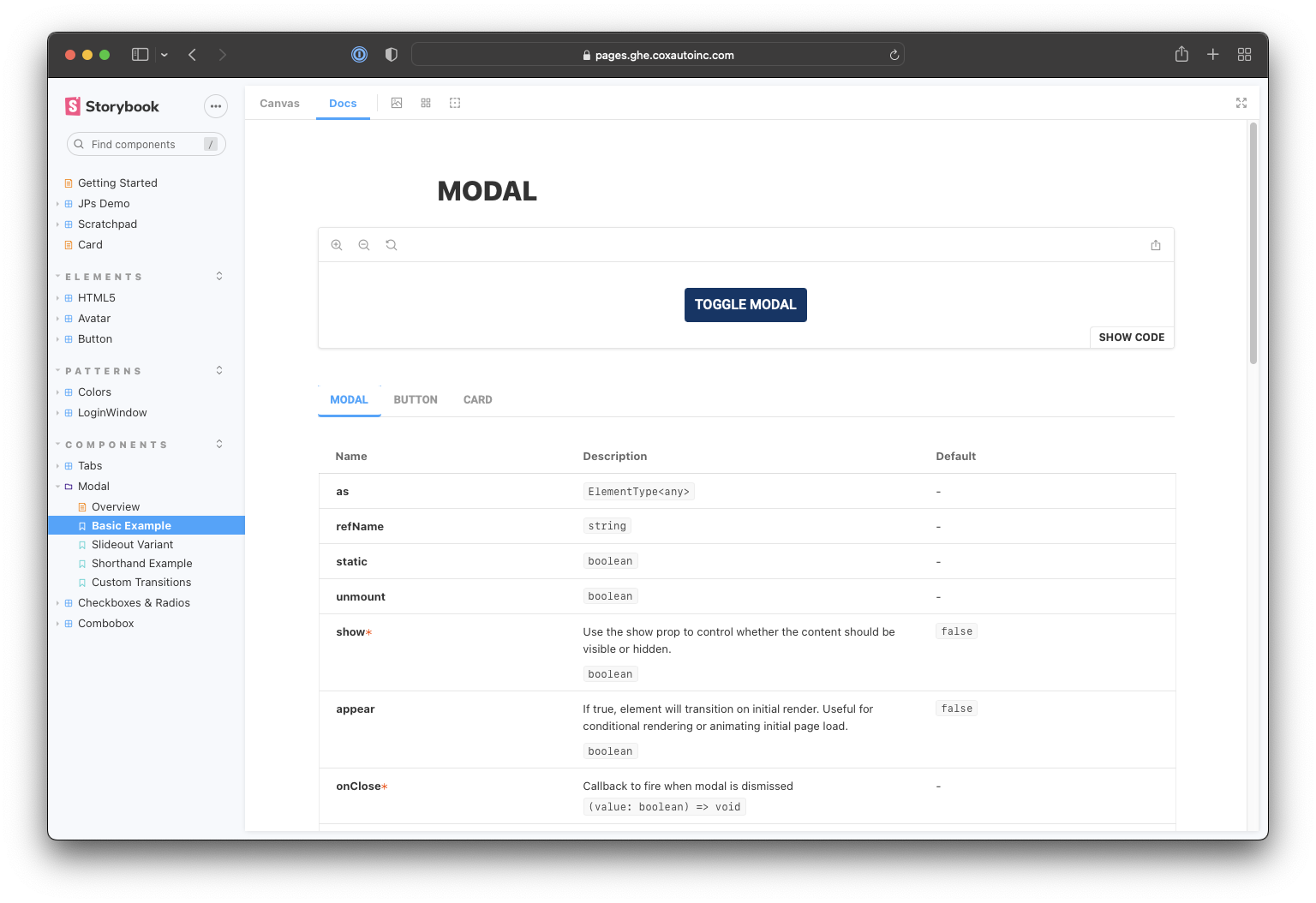
import Button from '@prism/button';

// Please start moving your dependencies to import the full library instead.
import { Button } from '@prism/library'

If you're using @prism/library

If your project is using @prism/library, adopting the LTS package will require only a tiny change:

// Current recommendation
import { Button } from '@prism/library'

// LTS opt-in recommendation (future transition, dates TBD)
import { Button } from '@prism/legacy'

We're excited to get working on 2.0 soon! For now, we are doing everything we can to ensure that the legacy package is stable and usable for the foreseeable future.. Stay tuned!

Moving to ESM-First Packages

(This section provides additional context for PRISM maintainers. Teams using PRISM in their projects should not need to read this section.)

PRISM 1.x is consists of a monorepo with nearly 50 separate packages. Each of the components is written with modern JavaScript using ES Modules. However, the code that is published to Artifactory is a transpiled CJS bundle. This means that the published code:

  • Does not support code splitting
  • Does not support ES Modules
  • Does not support dynamic imports
  • Dependencies are bundled rather than externalized.
  • Supports legacy development environments.
  • Supports non-React use cases.

However, in the four years since PRISM was first released, Cox has transitioned away from these legacy use cases. It is expected, then, that any team using PRISM in a new project will be able to consume ES Modules. Since CJS carries a number of limitations, we are transitioning to an ESM-first publishing model. Moving forward, CJS versions will be provided for PRISM 1.x through @prism/legacy only. We do not plan to support using @prism/legacy and @prism2 in the same working tree.

We expect this will simplify the publishing process, elminate a number of issues with conflicting dependencies and drastically reduce the import cost of PRISM components.

· One min read
Darin Cassler

New Features

  • Feature: Resolved ESLint/Restructure for Utilities US703869

Bugfix

  • Fixed an issue with Chip where setting type=filter did not append a cross icon as expected [no story]
  • Fixed an issue Actions component dropdown not closing on outside clickDE202183
  • Fixed an issue Searchable component onChange and renderingDE202534
  • Fixed an issue with IconSVG where the glyph name would be appended to screenreader text DE202531

· One min read
Darin Cassler

New Features

  • Feature: Add new icons: upload, download, export, and leave. Update cloud-upload glyph. US754532
  • Feature: Resolved ESLint/Restructure for Tooltip US703865

Bugfix

  • Fixed an issue where @prism/chip would attempt to spread React props into HTML output which resulted in certain test failures.
  • Fixed an issue where @prism/library would attempt to export undefined values from @prism/accordion
  • Fixed an issue where @prism/dropdown styles would be missing some variables. DE202072
  • Fix UI for aux button font and disabled buttons using pewter DE201710

· One min read
Darin Cassler

New Features

  • Feature: Resolved ESLint/Restructure for <Accordion />
  • Feature <Accordion /> now accepts a collapseSiblings argument which is false by default. Setting to true will automatically close other items when selecting a new one. US671646
  • Feature: <Dropdown /> now supports a readonly prop with corresponding styling US720376
  • Feature: Text <Input /> now supports a readonly prop with corresponding styling US720344
  • Feature: All Input, InputGroup, and FormGroup components now support a readonly prop with corresponding styling US720360
  • Feature: <TimePicker /> now supports a readonly prop with corresponding styling US720340
  • Feature: Resolved ESLint/Restructure for DataTable US671659
  • Feature: Resolved ESLint/Restructure for Filmstrip US671663
  • Feature: Resolved ESLint/Restructure for Table US703866

Bug Fixes

  • Fixed issue where <Button type="submit" /> would not fire onSubmit events from parent forms as expected.
  • Fixed an issue where <Searchable.Input /> would incorrectly append multiple icons resulting in a box-model break. GitHub PR - No Story

· One min read
Darin Cassler

New Features

  • Feature: <DatePicker /> now supports a readonly prop with corresponding styling US720333
  • Feature: Small-Large Variant and readonly state for Switch US698510
  • Feature: Resolved ESLint/Restructure for Indicator US671667
  • Feature: Resolved ESLint/Restructure for ImageViewer US671666
  • Feature: Resolved ESLint/Restructure for Input US671668
  • Feature: Resolved ESLint/Restructure for InputGroup US671669
  • Feature: Resolved ESLint/Restructure for Modal US671673
  • Feature: Resolved ESLint/Restructure for Searchable US671680
  • Feature: Resolved ESLint/Restructure for Slider US671683

Bug Fixes

  • Fixed issue where <Slider /> would not respond to touch inputs DE198653
  • Fixed issue where <Actions /> would not expand to show additional options DE199257

· 2 min read
Darin Cassler

New Features

  • Feature: Getting started documentation has been updated US705798
  • Feature: SCSS variables can now be overridden globally US720231
  • Feature: Added vertical row extender for DataTable US677133
  • Feature: updated Small & Large variant label for Input US720222
  • Feature: Resolved ESLint/Restructure for Actions US671647
  • Feature: Resolved ESLint/Restructure for AdaptiveSelect US671648
  • Feature: Resolved ESLint/Restructure for Anchor US703664
  • Feature: Resolved ESLint/Restructure for Autocomplete US671605
  • Feature: Resolved ESLint/Restructure for Checkbox US671654
  • Feature: Resolved ESLint/Restructure for Collapse US671657
  • Feature: Resolved ESLint/Restructure for Card US703863
  • Feature: Resolved ESLint/Restructure for Form US671664
  • Feature: Resolved ESLint/Restructure for DatePicker US671660
  • Feature: Resolved ESLint/Restructure for SingleSort US671681
  • Feature: Resolved ESLint/Restructure for Space US703870
  • Feature: Resolved ESLint/Restructure for Stepper US671685
  • Feature: Resolved ESLint/Restructure for Switch US703864
  • Feature: Resolved ESLint/Restructure for Tabs US703867
  • Feature: Resolved ESLint/Restructure for TimePicker US703868

Bugfixes

  • FIXED: Chip labels in MultiMediaViewer displayed text with low contrast DE195693
  • FIXED: Adjust MultimediaViewer asset paths when fetched from the Fyusion API to ensure the path is only prefixed when necessary. DE196886
  • FIXED: Issue where editing JSX examples would not update the HTML preview appropriately DE193186
  • FIXED: Issue where @prism/radios would appear black incorrectly DE195331
  • FIXED: Issue where @prism/scss had no built output DE193687
  • FIXED: Issue where toggling @prism/slideout from an Actions menu would result in incorrect animations DE183277

Housekeeping

  • TESTING: CI triggers now attempt to build docs website from source US727558
  • REMOVED: MenuButton has been removed from the codebase. US671671

· One min read
Darin Cassler

Bugfixes

  • FIXED: Button Component check with href on onClick callback US708963
  • FIXED: DataTable Component default rowcount DE193698
  • FIXED: DatePicker prevent default width for month DE192422
  • FIXED: MultiMedia Viewer filters issue DE192857
  • FIXED: Chip component now passes HTML attributes to rendered elements as expected. DE195014

New Features

  • Feature: Resolved ESLint/Restructure for Col US671656
  • Feature: Resolved ESLint/Restructure for Pagination US671676
  • Feature: Resolved ESLint/Restructure for Interstitial US671670
  • Feature: Resolved ESLint/Restructure for Navigation US671675
  • Feature: Resolved ESLint/Restructure for RadioButton US671677
  • Feature: Resolves ESLint/Restructure for Refinements US671678
  • Feature: Resolved ESLint/Restructure for Pagination US671676
  • Feature: Resolved ESLint/Restructure for Row US671679
  • Feature: Resolved ESLint/Restructure for SlideOut US671682
  • Feature: Resolved ESLint/Restructure for Spinner US671684