Slideout
- Design
- Recipe
- React
Usage
Like a modal window, a slide out panel is a child “window” which appears in front of the main content. They are an effective way to show and hide content that is only needed for short interactions.
Common Characteristics
All slide out panels appear on a 50% opacity black background by quickly sliding into view from the left or right side of the main window. Animation timing is preset to slide-in 250ms and slide out 200ms. They always have a heading, and a close function, plus additional content and controls. All slide out panels are the full height of the window, and width varies (see below).
While visible a slide out panel prevents the user from interacting with the main page. A user may close a slide out panel by clicking on the main window, or keyboard ESC, or “X”, or an action button.
<div className="interstate-docs__usage-demo interstate-sandbox interstate-sandbox">
  <div className="container bg-white">
    <div className="row pt-3 pb-3">
      <div className="col-6">
        <SlideOut triggerText="LEFT SLIDE OUT PANEL">
          <SlideOutHeader>
            <h1>THIS IS A SLIDE OUT PANEL</h1>
          </SlideOutHeader>
          <p>
            Lorem ipsum dolor sit amet, consectetur adipiscing elit. Aenean
            euismod bibendum. Proin sodales pulvinar sic tempor. Sociis natoque
            penatibus et magnis dis parturient montes, nascetur ridiculus mus.
            Magnis dis parturient montes, nascetur ridiculus mus.
          </p>
        </SlideOut>
      </div>
      <div className="col-6 d-flex justify-content-end">
        <SlideOut placement="right" triggerText="RIGHT SLIDE OUT PANEL">
          <SlideOutHeader>
            <h1>THIS IS A SLIDE OUT PANEL</h1>
          </SlideOutHeader>
          <p>
            Lorem ipsum dolor sit amet, consectetur adipiscing elit. Aenean
            euismod bibendum. Proin sodales pulvinar sic tempor. Sociis natoque
            penatibus et magnis dis parturient montes, nascetur ridiculus mus.
            Magnis dis parturient montes, nascetur ridiculus mus.
          </p>
        </SlideOut>
      </div>
    </div>
  </div>
</div>
Usage Guidelines
Slide out panels should be used for content that is only needed occasionally and should only be displayed at the user’s request. Use slide out panels instead of modal windows for complex interactions like long forms, or filters, or navigation menus.
Width
The width of a slide panel is not defined in order to allow designers to specify the width needed by the content in the design. It is recommended to specify the maximum width needed by number of columns or percent of screen, and the minimum width by pixels.
At the XS breakpoint, the slide out panel covers the full screen width.
Interaction
When a slide out panel is open, all functionality on the main window should be disabled including scrolling.
When the content of the slide out panel requires scrolling, any submit/cancel buttons should be locked to the bottom of the panel to remain visible.
Accessibility
Allow the user to dismiss a slide out panel using the keyboard's ESC key, or by clicking the main window, or by clicking close (“X”).
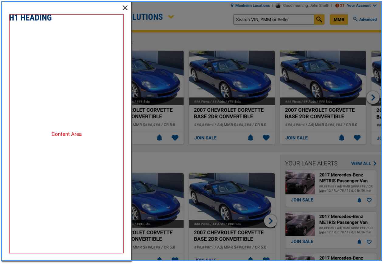
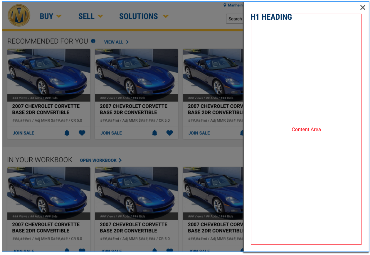
Design
SlideOut from left
SlideOut from Right
Code
Default SlideOut
<SlideOut triggerText="Open SlideOut" headerText="H1 Heading">
  <p>
    Lorem ipsum dolor sit amet, consectetur adipiscing elit. Aenean
    euismod bibendum. Proin sodales pulvinar sic tempor. Sociis natoque
    penatibus et magnis dis parturient montes, nascetur ridiculus mus.
    Magnis dis parturient montes, nascetur ridiculus mus.
  </p>
</SlideOut>
The default slide out appears from the left
SlideOut from Left
<SlideOut
  placement="left"
  triggerText="Open Left SlideOut"
  headerText="H1 Heading"
>
  <p>
    Lorem ipsum dolor sit amet, consectetur adipiscing elit. Aenean
    euismod bibendum. Proin sodales pulvinar sic tempor. Sociis natoque
    penatibus et magnis dis parturient montes, nascetur ridiculus mus.
    Magnis dis parturient montes, nascetur ridiculus mus.
  </p>
</SlideOut>
SlideOut from Right
<SlideOut
  placement="right"
  triggerText="Open Right SlideOut"
  headerText="H1 Heading"
>
  <p>
    Lorem ipsum dolor sit amet, consectetur adipiscing elit. Aenean
    euismod bibendum. Proin sodales pulvinar sic tempor. Sociis natoque
    penatibus et magnis dis parturient montes, nascetur ridiculus mus.
    Magnis dis parturient montes, nascetur ridiculus mus.
  </p>
</SlideOut>
SlideOut with maximum width
<SlideOut
  placement="right"
  triggerText="Open SlideOut"
  headerText="H1 Heading"
  maxWidth="50vw"
>
  <p>
    Lorem ipsum dolor sit amet, consectetur adipiscing elit. Aenean
    euismod bibendum. Proin sodales pulvinar sic tempor. Sociis
    natoque penatibus et magnis dis parturient montes, nascetur
    ridiculus mus. Magnis dis parturient montes, nascetur ridiculus
    mus.
  </p>
</SlideOut>
SlideOut with fixed width
The Slide Out width is meant to be determined by its content.
The maxWidth prop is recommended to specify the width of a slideout that should not take up the full view width.
However, a fixed with can be added to the slideout content by manually setting the styled width.
<SlideOut
  placement="right"
  triggerText="Open SlideOut"
  headerText="H1 Heading"
>
  <div style={{width: '50vw'}}>
    <p>
      Small slideout content
    </p>
  </div>
</SlideOut>
The defined content width must be in either px, em, rem, or vw, but cannot be percentage(%) based. The width of the Slide Out can also be managed in CSS by targeting the .slide-out-body class.
Actionable SlideOut with custom trigger
function ActionableSlideOut() {
  const [isOpen, setIsOpen] = useState(false);

  const toggle = () => setIsOpen(!isOpen);

  return (
    <div>
      <SlideOut
        actionable
        onCloseButtonClick={toggle}
        open={isOpen}
      >
        <SlideOut.Header><h2>Custom Header</h2></SlideOut.Header>
        <p>Slideout content goes here</p>
        <Button onClick={toggle} outline>
          Custom Close Button
        </Button>
      </SlideOut>

      <SlideOut.Trigger onClick={toggle} text="Custom Trigger"/>
    </div>
  );
}
The actionable prop gives up control of the inital open state to the SlideOut component's open prop, allowing for customization.
Props
| Name | Type | Default | Description |
|---|---|---|---|
| actionable | boolean | false | Gives up control of the SlideOut component’s open state to the open prop, allowing for customization. If this is true, onCloseButtonClick must also be defined. |
| headerText | string | undefined | Sets the text for an h1 header element displayed in the slideout |
| maxWidth | string | undefined | Sets the maximum styled width for the slideout |
| onCloseButtonClick | function | () => {} | Sets the function called when the close button is clicked in an actionable slideout |
| open | boolean | false | Sets the initial open state for the slideout. For actionable slideout, controls the open state. |
| placement | string | "left" | Sets whether the slideout slides in from the left or the right |
| triggerClassName | string | "btn btn-outline" | Sets the class name on the slideout trigger element |
| triggerHref | string | undefined | Sets the href for the slideout trigger element |
| triggerTag | string | "button" | Sets the tag type for the slideout trigger element |
| triggerText | string | undefined | Sets the text for the slideout trigger element |
Description
Like a modal window, a slide out panel is a child “window” which appears in front of the main content. They are an effective way to show and hide content that is only needed for short interactions.
Ingredients
Links are made up of a combination of elements and classes. The styles will be made up of Required, Selectable, and Optional classes.
Required
.slideout- the content container with the header and footer.slideout-header- the lockup of the title and close buttons.slideout-title- header text.slideout-close- a close button fixed to the top right.slideout-body- can be any content.slideout-footer- expected to only have buttons as children
Selectable
position
.slideout-left- pins the Slideout to the left of the container.slideout-right- pins the Slideout to the right of the container
Optional
.slideout-pin-footer- attaches the footer to the bottom of the modal window
Directions
The Slideout component is used in conjunction with the Overlay component.
The width of the Slideout is determined by the width of the content. Setting the width of the Slideout can also be done at the instance level.
Slideout anchored to the right
To attach the Slideout on the right of the, use the slideout-right class.
Lorem ipsum dolor sit amet, consectetur adipiscing elit, sed do eiusmod tempor incididunt ut labore et dolore magna aliqua. Ut diam quam nulla porttitor massa.
Dolor sed viverra ipsum nunc aliquet bibendum. Ut consequat semper viverra nam libero justo laoreet sit amet. Vestibulum morbi blandit cursus risus.
Velit sed ullamcorper morbi tincidunt ornare massa eget egestas purus. Donec ac odio tempor orci dapibus ultrices in iaculis nunc. Sed augue lacus viverra vitae.
Id aliquet risus feugiat in ante metus dictum. Nibh tortor id aliquet lectus proin. Justo nec ultrices dui sapien eget mi proin.
Erat pellentesque adipiscing commodo elit at imperdiet. Facilisi nullam vehicula ipsum a arcu cursus vitae congue mauris. Mattis enim ut tellus elementum.
Gravida dictum fusce ut placerat orci nulla pellentesque. In mollis nunc sed id semper risus. Sit amet facilisis magna etiam tempor orci eu lobortis elementum.
Enim nunc faucibus a pellentesque sit amet porttitor. Neque gravida in fermentum et. Vitae justo eget magna fermentum iaculis eu. Porttitor massa id neque aliquam. Diam maecenas sed enim ut sem viverra.
Slideout anchored to the left
To attach the Slideout on the left of the, use the slideout-left class.
Lorem ipsum dolor sit amet, consectetur adipiscing elit, sed do eiusmod tempor incididunt ut labore et dolore magna aliqua. Ut diam quam nulla porttitor massa.
Dolor sed viverra ipsum nunc aliquet bibendum. Ut consequat semper viverra nam libero justo laoreet sit amet. Vestibulum morbi blandit cursus risus.
Velit sed ullamcorper morbi tincidunt ornare massa eget egestas purus. Donec ac odio tempor orci dapibus ultrices in iaculis nunc. Sed augue lacus viverra vitae.
Id aliquet risus feugiat in ante metus dictum. Nibh tortor id aliquet lectus proin. Justo nec ultrices dui sapien eget mi proin.
Erat pellentesque adipiscing commodo elit at imperdiet. Facilisi nullam vehicula ipsum a arcu cursus vitae congue mauris. Mattis enim ut tellus elementum.
Gravida dictum fusce ut placerat orci nulla pellentesque. In mollis nunc sed id semper risus. Sit amet facilisis magna etiam tempor orci eu lobortis elementum.
Enim nunc faucibus a pellentesque sit amet porttitor. Neque gravida in fermentum et. Vitae justo eget magna fermentum iaculis eu. Porttitor massa id neque aliquam. Diam maecenas sed enim ut sem viverra.
Slideout anchored to the right with a pinned footer
To pin the footer, use the slideout-pin-footer class. The footer will automatically
pin to the bottom on small screens.
Lorem ipsum dolor sit amet, consectetur adipiscing elit, sed do eiusmod tempor incididunt ut labore et dolore magna aliqua. Ut diam quam nulla porttitor massa.
Dolor sed viverra ipsum nunc aliquet bibendum. Ut consequat semper viverra nam libero justo laoreet sit amet. Vestibulum morbi blandit cursus risus.
Velit sed ullamcorper morbi tincidunt ornare massa eget egestas purus. Donec ac odio tempor orci dapibus ultrices in iaculis nunc. Sed augue lacus viverra vitae.
Id aliquet risus feugiat in ante metus dictum. Nibh tortor id aliquet lectus proin. Justo nec ultrices dui sapien eget mi proin.
Erat pellentesque adipiscing commodo elit at imperdiet. Facilisi nullam vehicula ipsum a arcu cursus vitae congue mauris. Mattis enim ut tellus elementum.
Gravida dictum fusce ut placerat orci nulla pellentesque. In mollis nunc sed id semper risus. Sit amet facilisis magna etiam tempor orci eu lobortis elementum.
Enim nunc faucibus a pellentesque sit amet porttitor. Neque gravida in fermentum et. Vitae justo eget magna fermentum iaculis eu. Porttitor massa id neque aliquam. Diam maecenas sed enim ut sem viverra.
Developer Kitchen
Now it's your turn! Select options for the Slideout component and see how they can be combined in the final output.
Lorem ipsum dolor sit amet, consectetur adipiscing elit, sed do eiusmod tempor incididunt ut labore et dolore magna aliqua. Ut diam quam nulla porttitor massa.
Dolor sed viverra ipsum nunc aliquet bibendum. Ut consequat semper viverra nam libero justo laoreet sit amet. Vestibulum morbi blandit cursus risus.
Velit sed ullamcorper morbi tincidunt ornare massa eget egestas purus. Donec ac odio tempor orci dapibus ultrices in iaculis nunc. Sed augue lacus viverra vitae.
Id aliquet risus feugiat in ante metus dictum. Nibh tortor id aliquet lectus proin. Justo nec ultrices dui sapien eget mi proin.
Erat pellentesque adipiscing commodo elit at imperdiet. Facilisi nullam vehicula ipsum a arcu cursus vitae congue mauris. Mattis enim ut tellus elementum.
Gravida dictum fusce ut placerat orci nulla pellentesque. In mollis nunc sed id semper risus. Sit amet facilisis magna etiam tempor orci eu lobortis elementum.
Enim nunc faucibus a pellentesque sit amet porttitor. Neque gravida in fermentum et. Vitae justo eget magna fermentum iaculis eu. Porttitor massa id neque aliquam. Diam maecenas sed enim ut sem viverra.