Tab
- Design
- Recipe
- React
Usage
Definition
Tabs organize content within a category in a horizontal menu of logical subsections.
Each tab within a group contains a distinct subsection of content.
Common Characteristics
All tabs are presented horizontally and have ALL-CAPS labels. All tabs have a separator that spans the width of the content area governed by the tabs. Tabs have these states: selected, active, hover/tap, and focused. A Tab with no content must have explanatory text rather than left blank.
Usage Guidelines
The left-most tab is always pre-selected by default. Content within tabs must be peers related to the same parent category/topic/item. If necessary, tabs can scroll horizontally above the content they govern.
<SandboxDemo>
  <div className="container bg-white">
    <div className="row">
      <div className="col-12">
        <Tabs
          color="light"
          data={Data.TabDataUsage}
          activeIndex={0}
        />
      </div>
    </div>
  </div>
</SandboxDemo>
Tabs can scroll above the content if needed. Tabs with no content must have explanatory text. Click the second tab for an example.
Design
States
Tabs have these states: selected, active, hover/tap, and focused.
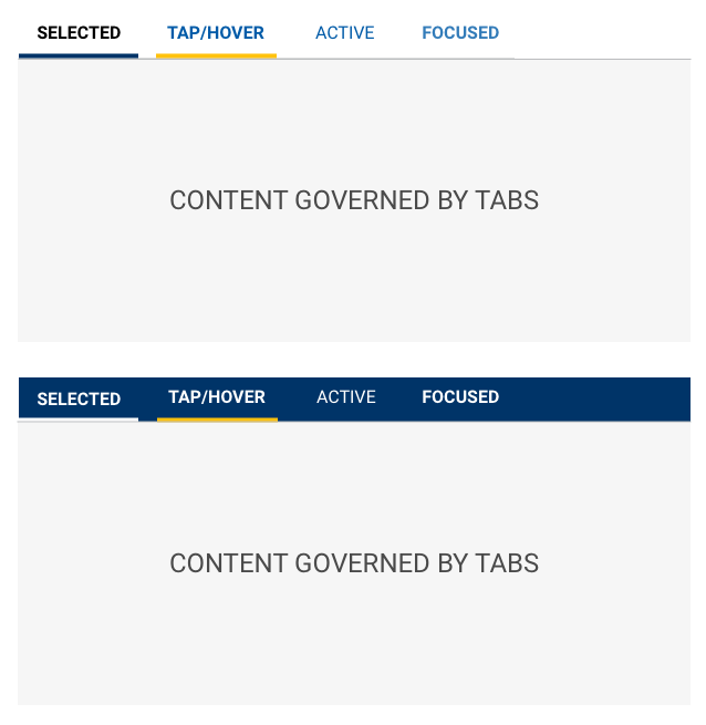
Tabs are left aligned with a visual separator that spans the width of the content governed by the tabs.
SCSS
Modifiers
| Name | Description |
|---|---|
| tab-light-bkg | Tabs on a Light Background |
| tab-dark-bkg | Tabs on a Dark Background |
| tab-icon-light-bkg | Icon Tab Bar (TOP) on a Light Background |
| tab-icon-dark-bkg | Icon Tab Bar (TOP) on a Dark Background |
| tab-icon-light-bkg-bottom | Icon Tab Bar (BOTTOM) on a Light Background |
| tab-icon-dark-bkg-bottom | Icon Tab Bar (BOTTOM) on a Dark Background |
Code
Tabs
Props on the Tabs component will apply to the entire collection. Props on the
TabPane will cascade to the Tab component and the underlying Action
component.
Tabs can have label and icons
Tabs can have either label and icons
Tabs can set textOnly or iconOnly
Tab Active
The active tab is set to zero (0) by default and can be set to any tab index.
Tab Color
Tabs can be used on light backgrounds
Tabs can be used on dark backgrounds
Tab Border
Tabs can be used with a border below the tabs
Tabs has a bottom border by default. This is controlled by a boolean property border
Tabs can be used without a border below the tabs
This is often used when using a dark background color.
Tabs can link externally
Tabs use Buttons under the hood allowing for an href to be provided as a link to an external page.
Tab content updates with changes
() => {

const [words, setWords] = React.useState({
  nouns: 'cushions',
  adjective: 'quirky',
  verb: 'flow',
  noun3: 'glass',
  noun4: 'seahorse',
  season: 'fall',
})

const handleWordChange = (e) => {
  setWords({
    ...words,
    [e.target.id]: e.target.value
  })
}

const say = (what) => <strong>{what}</strong>

return (
  <Tabs activeIndex={1} position="bottom">
    <TabPane label="Words" icon="list">
      <Form>
        <Container>
          <Row>
            <Col>
              <Input.Interactive id="nouns"
                label="Plural noun"
                defaultValue={words.nouns}
                onChange={handleWordChange}/>
              <Input.Interactive id="noun3"
                label="Noun"
                defaultValue={words.noun3}
                onChange={handleWordChange}/>
              <Input.Interactive id="noun4"
                label="Noun"
                defaultValue={words.noun4}
                onChange={handleWordChange}/>
              </Col>
              <Col>
              <Input.Interactive id="adjective"
                label="Adjective"
                defaultValue={words.adjective}
                onChange={handleWordChange}/>
              <Input.Interactive id="verb"
                label="Verb"
                defaultValue={words.verb}
                onChange={handleWordChange}/>
              <Input.Interactive id="season"
                label="Season"
                defaultValue={words.season}
                onChange={handleWordChange}/>
              </Col>
            </Row>
          </Container>
      </Form>
    </TabPane>
    <TabPane label="Madness" icon="file-text">
      <p>
        Our {say(words.nouns)} are packed for a hike
        in the {say(words.adjective)} mountains!
        The higher we {say(words.verb)}, the
        smaller the {say(words.noun3)} appear; we
        may even see {say(words.noun4)} still on the
        ground from last {say(words.season)}.
      </p>
    </TabPane>
  </Tabs>
)}
Tab generated from data prop
<Tabs activeIndex={0} data={[{
    label: { icon: 'car' },
    content: 'Id sed viris concludaturque, eum facilis rationibus in, qui case munere te. Quo diceret voluptatum id? Id sed sint appetere, ancillae facilisis imperdiet vix ne? Nec in aliquam rationibus scribentur, no per voluptua constituam. Solet aliquando voluptatibus et vel, his id delicata adipiscing. Malis quando per ei.\n\nTe vix vocent vocibus accommodare. Pro eu eripuit democritum elaboraret. Vix inermis philosophia no? Ea libris alienum qui. Ea solet perpetua intellegebat mel, ea his aperiri atomorum.'
  }, {
    label: { icon: 'bell' },
    content: 'Dicam putent pertinax ne vim, ad qui pertinax suavitate, mea eu amet nominati. Te porro dolor eam, at sit paulo corpora! Ne mea modus docendi postulant. Vel solet commodo aliquando an, qui harum oportere mediocrem ne.\n\nId sed probo honestatis, vel in ignota recusabo. An dicunt feugait omittantur est, cu atomorum iudicabit gloriatur eum, pro tale sensibus comprehensam an! Nostrum detracto noluisse qui at, at vivendo mnesarchum nec. Rebum vivendo usu eu, eam partiendo suavitate ex.'
  }]} />
Tab generation from data prop can be dynamic
() => {

const [words, setWords] = React.useState({
  nouns: 'cushions',
  adjective: 'quirky',
  verb: 'flow',
  noun3: 'glass',
  noun4: 'seahorse',
  season: 'fall',
})

const handleWordChange = (e) => {
  setWords({
    ...words,
    [e.target.id]: e.target.value
  })
}

const say = (what) => <strong>{what}</strong>

const data = [
  {
    label: {
      icon: 'list',
      text: 'Words',
    },
    content: <Form>
        <Container>
          <Row>
            <Col>
              <Input.Interactive id="nouns"
                label="Plural noun"
                defaultValue={words.nouns}
                onChange={handleWordChange}/>
              <Input.Interactive id="noun3"
                label="Noun"
                defaultValue={words.noun3}
                onChange={handleWordChange}/>
              <Input.Interactive id="noun4"
                label="Noun"
                defaultValue={words.noun4}
                onChange={handleWordChange}/>
              </Col>
              <Col>
              <Input.Interactive id="adjective"
                label="Adjective"
                defaultValue={words.adjective}
                onChange={handleWordChange}/>
              <Input.Interactive id="verb"
                label="Verb"
                defaultValue={words.verb}
                onChange={handleWordChange}/>
              <Input.Interactive id="season"
                label="Season"
                defaultValue={words.season}
                onChange={handleWordChange}/>
              </Col>
            </Row>
          </Container>
      </Form>
  },
  {
    label: {
      icon: 'file-text',
      text: 'Madness',
    },
    content: <p>
        Our {say(words.nouns)} are packed for a hike
        in the {say(words.adjective)} mountains!
        The higher we {say(words.verb)}, the
        smaller the {say(words.noun3)} appear; we
        may even see {say(words.noun4)} still on the
        ground from last {say(words.season)}.
      </p>
  }
]

return (
  <Tabs activeIndex={1} position="bottom" data={data} />
)}
Tab Props
Tabs
| Name | Type | Default | Description |
|---|---|---|---|
| activeIndex | number | 0 | Sets the currently selected tab index (the first tab's index is zero (0)) |
| border | bool | true | Toggles the border below the tab buttons |
| className | string | String of classnames to add to the Tabs container | |
| color | "light" or "dark" | "light" | Sets color state of tabs. Must be either "light" or "dark" |
| data | array[dataShape] | null | Allows for tab construction via an object |
| iconOnly | bool | Sets the tab buttons to display only icon provided | |
| id | string | uuid() | String used as the id attribute of the Tabs container |
| onChange | func | Callback function for when the activeIndex is modified. Sends an object containing prevActiveIndex and activeIndex. | |
| size | "sm" or "md" | "md" | Sets the display size of the tabs. Must be either "md" or "sm" |
| textOnly | bool | Sets the tab buttons to display only text provided |
TabBar
| Name | Type | Default | Description |
|---|---|---|---|
| border | bool | true | Toggles the border below the tab buttons |
| className | string | null | String of classnames to add to the TabBar container |
| id | string | uuid() | String used as the id attribute of the TabBar container |
TabItem
| Name | Type | Default | Description |
|---|---|---|---|
| active | string | Sets the pane's active state | |
| addOnAppend | string | Icon name to display before the label | |
| addOnPrepend | string | Icon name to display after the label | |
| className | string | String of classnames to add to the TabPane container | |
| iconOnly | string | Sets the tab buttons to display only icon provided | |
| label | string | Text value to display | |
| onClick | string | Callback function for when the tab is acted upon. | |
| textOnly | string | Sets the tab buttons to display only text provided |
TabPane
| Name | Type | Default | Description |
|---|---|---|---|
| active | bool | false | Sets the pane's active state |
| className | string | null | String of classnames to add to the TabPane container |
| id | string | null | String used as the id attribute of the TabPane container |
| isAnimated | bool | true | Denotes if the panel ought to fade |
Data Shape
| Name | Type | Required? | Description |
|---|---|---|---|
| className | string | Classname for the TabPane | |
| content | string | Yes | TabPane content |
| disabled | bool | Selecting TabItem is disabled | |
| id | string | Id for the Tab | |
| label | string or {icon,text} | Text label for the TabItem or an object containing the icon and/or text label for the TabItem | |
| tabClassName | string | Classname for the TabItem | |
| tabId | string | Id value for the TabItem |
Definition
Tabs organize content within a category in a horizontal menu of logical subsections.
Each tab within a group contains a distinct subsection of content.
Common Characteristics
All tabs are presented horizontally and can scroll when necessary.
All tabs have a separator that spans the width of the content area governed by the tabs.
Tabs have these states: default (selectable), selected, active, hover/tap, focused and disabled.
A Tab with no content must have explanatory text rather than be left blank.
Ingredients
Tabs are made up of at least one CTA and one pane for content.
State Definitions
.tab- Default state for a tab.tab[aria-selected="true"]- State of a selected tab..tab:hover- State of a hovered or tapped tab..tab:active- State of an active tab..tab:focus- State of a focused tab..tab[disabled]- State of a disabled tab.
Basic Tabs
A basic tabs example.
Disabled Tab
A basic tabs example with a disabled tab.
Tabs with icons
Each tab can be prefixed with an icon as a visual aid.
Tabs with icons and wrapping labels
Note: There are no specified rules for when a label should wrap. This example uses a <br> element to create a line break and demonstrate the look of a tab with a wrapping label.
Scrollable tabs
Tabs will scroll horizontally when the container doesn't fit all the available tabs.
Developer Kitchen
Now it's your turn! Select options for the Card component and see how they can be combined in the final output.