Button Group
Button Groups
Usage
Definition
Button Groups allow a user to select one item from a small set of options. They can be used as toggles, as scoping controls, and as a substitute for radio buttons, or tabs.
Full-screen width button groups are optionally allowed on the XS grid (0-479). In most cases, button groups should only be as wide as the labels plus minimum left/right padding demand.
Common Characteristics
All button groups have bold, ALL-CAPS labels.
The button on the left is always pre-selected by default.
Buttons in a group have these states: active, focused, hover/tap, and selected.
Size
Button Groups are normally 40px high, but a small 32px alternative may be used. Whichever size is used, use the same size for any associated elements like text inputs.
Labels should be as short as possible and each button in a group should be the same width. If this can’t be achieved because of varied label lengths, consider using a different control.
Scenarios
Using as a Toggle

Button Groups used as View and Sort controls. Always pre-select the most common option on the left.
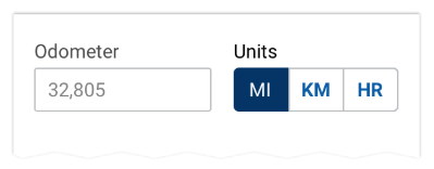
Using as a Scoping Control
A button group used to scope another control Always pre-select the most common option on the left. A button group label is optional.
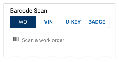
Using as Radio Buttons
Always pre-select the most common option on the left. A button group label is optional.
Replacing Tabs
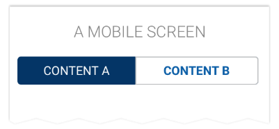
A button group can be used as tabs on mobile apps.
States
Buttons in a group have these states: active, focused, hover/tap, and selected.
Size
Button Groups are normally 40px high, but a small 32px alternative may be used. Whichever size is used, use the same size for any associated elements like text inputs.
Labels should be as short as possible and each button in a group should be the same width. If this can’t be achieved because of varied label lengths, consider using a different control.
Full-screen width button groups are optionally allowed on the XS grid (0-479). In most cases, button groups should only be as wide as the labels plus minimum left/right padding demand.
<SandboxDemo>
  <Col xs={12}>
    <Row>
      <ButtonGroup>
        <Button className="active" variant="outline">
          Selected
        </Button>
        <Button variant="outline" className="hover">
          Hover/Tap
        </Button>
        <Button variant="outline">Unselected</Button>
      </ButtonGroup>
    </Row>
  </Col>
</SandboxDemo>
A normal size button group with varying labels
<SandboxDemo>
<Col>
  <Row>
    <ButtonGroup>
      <Button size="sm" className="active" variant="outline">
        Selected
      </Button>
      <Button size="sm" className="hover" variant="outline">
        Hover/Tap
      </Button>
      <Button size="sm" variant="outline">
        Unselected
      </Button>
    </ButtonGroup>
  </Row>
</Col>
</SandboxDemo>
A small button group
Code
Toggling Items
function ({ active:propActive='MIDDLE', size=null }) {
  const [active, setActive] = useState(propActive)

  const handleClick = (type) => () => {
    setActive(type)
  }

  const makeButton = (name) => {
    const type = name.toUpperCase()

    return (
      <Button
        active={active === type}
        variant="outline"
        onClick={handleClick(type)}
      >{name}</Button>
    )
  }

  return (
    <ButtonGroup size={size}>
      <Button
        active={active === 'LEFT'}
        variant="outline"
        onClick={handleClick('LEFT')}
      >Left</Button>
      <Button
        active={active === 'MIDDLE'}
        variant="outline"
        onClick={handleClick('MIDDLE')}
      >Middle</Button>
      <Button
        active={active === 'RIGHT'}
        variant="outline"
        onClick={handleClick('RIGHT')}
      >Right</Button>
    </ButtonGroup>
  )
}
Controlled State
function ({ active:propActive='MIDDLE', size=null }) {
  const [active, setActive] = useState([ propActive ])

  const handleClick = (type) => () => {
    if (active.includes(type)) {
      setActive(active.filter(a => a !== type))
      document.activeElement.blur()
    } else {
      setActive([...active, type])
    }
  }

  return (
    <ButtonGroup size={size}>
      <Button
        active={active.includes('LEFT')}
        variant="outline"
        onClick={handleClick('LEFT')}
      >Left</Button>
      <Button
        active={active.includes('MIDDLE')}
        variant="outline"
        onClick={handleClick('MIDDLE')}
      >Middle</Button>
      <Button
        active={active.includes('RIGHT')}
        variant="outline"
        onClick={handleClick('RIGHT')}
      >Right</Button>
    </ButtonGroup>
  )
}
Group sizing
<Col>
  <Row>
    <ButtonGroup size="sm">
      <Button variant="outline">Left</Button>
      <Button active variant="outline">Middle</Button>
      <Button variant="outline">Right</Button>
    </ButtonGroup>
  </Row>
  <Row>
    <ButtonGroup>
      <Button size="sm" variant="outline">Left</Button>
      <Button active size="sm" variant="outline">Middle</Button>
      <Button size="sm" variant="outline">Right</Button>
    </ButtonGroup>
  </Row>
</Col>
Props
ButtonGroup
| Name | Type | Default | Description |
|---|---|---|---|
| tag | custom | "div" | Sets the element type for the button group container |
| role | string | "group" | Sets the button group container's role attribute for browser accessibility |
| aria-label | string | null | Sets the button group container's aria-label attribute which is used in cases where a text label is not visible on the screen. |
| className | string | null | Sets a custom class on the button group container element |
| vertical | boolean | false | Displays the button group buttons vertically |