Usage
The Auto-complete input allows a user to quickly select a single, valid input by dynamically matching text with a list of defined options (e.g. account names, cities, states, etc). It is often preferred over a drop down when there are more than 12 defined options.Common Characteristics
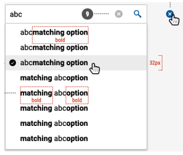
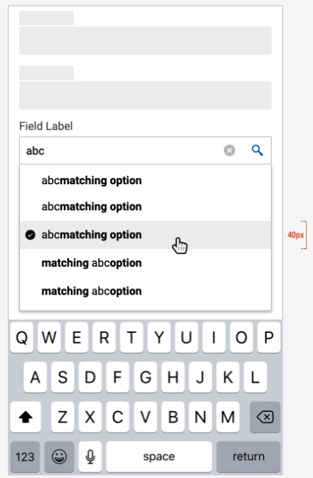
The auto-complete input combines a text input with icon, with a panel of text matches. Matches dynamically update as the user types. The non-typed portion of matches is displayed in bold text. Only one match can be selected as the input. The selection can be cleared.
The text input can be 40px high (normal) or 32px (small). The width is variable.
For accessibility, the text matches can be navigated and selected with the keyboard.
States and Options
The auto-complete input can have these states: default (empty), disabled, focused, error, or populated. The error state only applies if the input is required but is skipped.
Type to select a U.S. State.
Displaying Matches
The text matches panel can be set to display after one, or two, or three characters are typed in the input. Three characters is the default.
Display a maximum of eight matches on larger break points, five on the XS breakpoint.
Design
Anatomy
 Size: small
 Size: default on mobile
Code
Default Array
function defaultDemo() {
const options = [
'Arizona',
'Alaska',
'Arkansas',
'Alabama',
];
return (
<Autocomplete
name="defaultDemo"
placeholder="Choose a state"
options={options}
/>
);
}
Objects
Objects may take any shape. By default, the label key is used when rendering
the options.
function objectOptions() {
const makesWithLabel = [
{ label: 'Cadillac', id: 'Cadillac' },
{ label: 'BMW', id: 'BMW' },
{ label: 'Chevrolet', id: 'Chevrolet' },
{ label: 'Audi', id: 'audi' },
];
return (
<div>
<Autocomplete
placeholder="Choose a make"
options={makesWithLabel}
/>
</div>
);
}
When no label key is available or another value is preferred, use the
labelKey prop modify which value is presented.
function objectOptions() {
const makesWithLabel = [
{ label: 'Cadillac', id: 'Cadillac' },
{ label: 'Audi', id: 'audi' },
{ label: 'BMW', id: 'BMW' },
{ label: 'Chevrolet', id: 'Chevrolet' },
];
return (
<div>
<Autocomplete
labelKey="id"
placeholder="Choose a make"
options={makesWithLabel}
/>
</div>
);
}
Size
function minimumChars() {
const options = ['Alabama', 'Alaska ', 'Arizona ', 'Arkansas '];
return (
<Autocomplete
minLength={1}
size="small"
name="minCharDemo"
placeholder="Choose a state"
options={options}
/>
);
}
function minimumChars() {
const options = ['Alabama', 'Alaska ', 'Arizona ', 'Arkansas '];
return (
<Autocomplete
minLength={1}
name="minCharDemo"
placeholder="Choose a state"
options={options}
/>
);
}
Default Selection
function defaultSelection() {
const options = [
'Arizona ',
'Arkansas ',
'California',
'Colorado ',
'Connecticut',
];
return (
<div>
<Autocomplete
name="defaultSelection"
placeholder="Choose a state"
options={options}
defaultSelected={['Arkansas']}
/>
</div>
);
}
Public Methods
function Public() {
const options = [
'Arizona ',
'Arkansas ',
'California',
'Colorado ',
'Connecticut',
];
const getThisVal = () => {
let getIt = this.typeahead.getInstance().getInput();
alert(getIt.value);
};
return (
<div>
<Row>
<Button onClick={() => this.typeahead.getInstance().clear()}>
Clear
</Button>
<Button onClick={() => this.typeahead.getInstance().focus()}>
Focus
</Button>
<Button onClick={() => this.typeahead.getInstance().clear()}>
Blur
</Button>
<Button onClick={() => getThisVal()}>Get Input</Button>
</Row>
<Autocomplete
name="public"
placeholder="Choose a state"
options={options}
innerRef={typeahead => (this.typeahead = typeahead)}
/>
</div>
);
}
| property | propType | required | default | description |
|---|
| clearButton | other | - | true | |
| disabled | bool | - | false | |
| minLength | number | - | 3 | |
| selectHintOnEnter | other | - | true | |
| paginate | bool | - | false | |
| id | other | - | uuid() | |
| className | string | - | - | |
| children | node | - | - | |
| innerRef | object | func | string | - | - | |
| placeholder | string | - | - | |
| onChange | func | - | - | |
| selected | object | func | string | - | - | |
| options | object | func | string | array | - | - | |
| caseSensitive | bool | - | - | |
| ignoreDiacritics | bool | - | - | |
| size | string | - | - | |
| isInvalid | bool | - | - | |
| isValid | bool | - | - | |
| labelKey | object | func | string | - | label | |
| defaultSelected | object | array | string | number | - | - | |
| onMenuHide | func | - | - | |
| onMenuShow | func | - | - | |
| onMenuToggle | func | - | - | |
| onKeyDown | func | - | - | |
| onInputChange | func | - | - | |
| onFocus | func | - | - | |
| onBlur | func | - | - | |
| multiple | bool | - | - | |
| defaultOpen | bool | - | - | |