Table
Usage
The Basic Table is primarily for single lines of data but can be adjusted to accommodate block list data and paragraphs.
Common Characteristics
The Basic Responsive Table is built with these default properties:
- Headings and cells within the same column always share the same alignment.
- The left column is always left-aligned and cannot be changed.
- Other columns are left-aligned by default and can be changed (see usage guidelines below).
- The header row has a white background and bottom stroke by default.
- All rows have a white background and bottom stroke with hover / tap states.
- Headings and data reflow at the XS and S breakpoints.
- Text is truncated by default if it cannot be displayed on one line. Truncated text is viewable in a tool tip on hover / tap.
Table Options
The following options are built into the Basic Responsive Table:
- Columns can be optionally right- or center-aligned (except the left column).
- Top and bottom padding can be reduced for “tight” viewing.
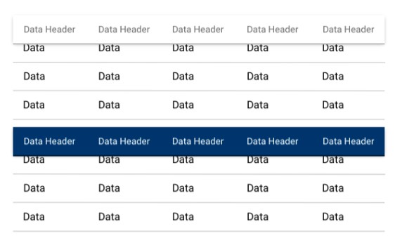
- The header row can be switched to light or dark backgrounds.
- The header row can be pinned to facilitate scanning on long tables.
- The table can be optionally placed in a distinct visual container.
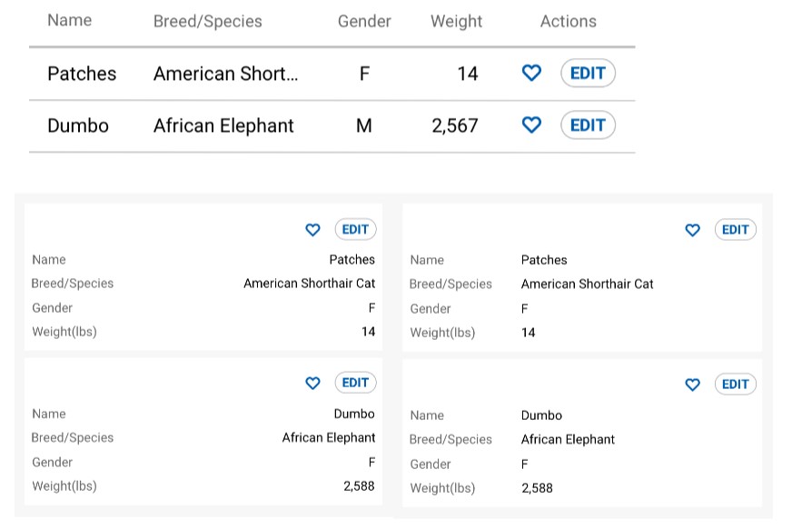
- Cells can contain text, icons, and/or interactive elements.
- Two responsive layout options are available for the XS-S breakpoints. Data is right-aligned by default but can be left-aligned.
- A pagination component and results per page button group can be added optionally.
- A responsive sort control can be added optionally.
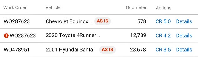
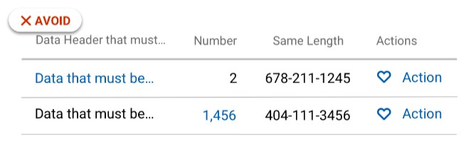
Cells can contain text, icons, Indicators and cell-level actions. Avoid linking data and group row-level actions in the right column.
Data in the XS-S breakpoints is right-aligned by default and can be left-aligned. The background should be #F7F7F7
Usage Guidelines
To promote ease of scanning and understanding, follow these UX best practices:
- Keep heading labels short.
- Use the default left-alignment in most cases.
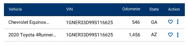
- Numbers of varying lengths should be right aligned (e.g. odometer, dollar amounts).
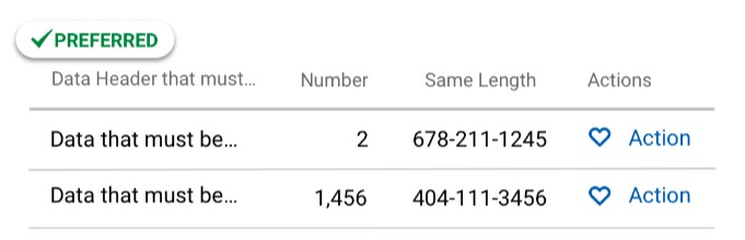
- Data of the same length may be optionally center- or right-aligned (e.g. phone numbers, VINs, state abbreviations, icons)
- Avoid scattering interactive elements in tables. Group interactive elements in the right column as much as possible to reduce motor activity and provide consistency between tables. Actions in the right column will reflow above data groups in the XS-S breakpoints.
Data should be aligned according to best practices.
Actions should be grouped in the right column as much as possible.
Avoid sprinkling actions in multiple columns.
STYLE
Spacing
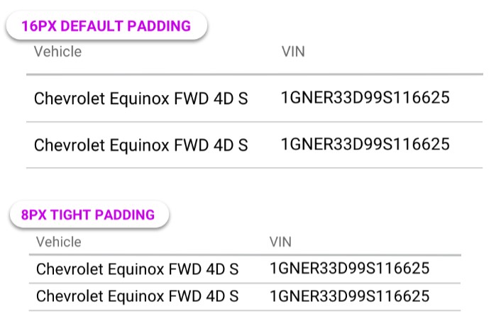
Data rows have 16px default top/bottom padding. This can be changed to 8px for a tight layout.
Actions
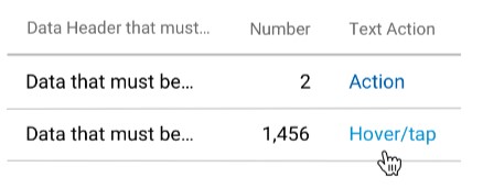
Actions in tables are non-bold and have a hover/tap state.
Header Style Options
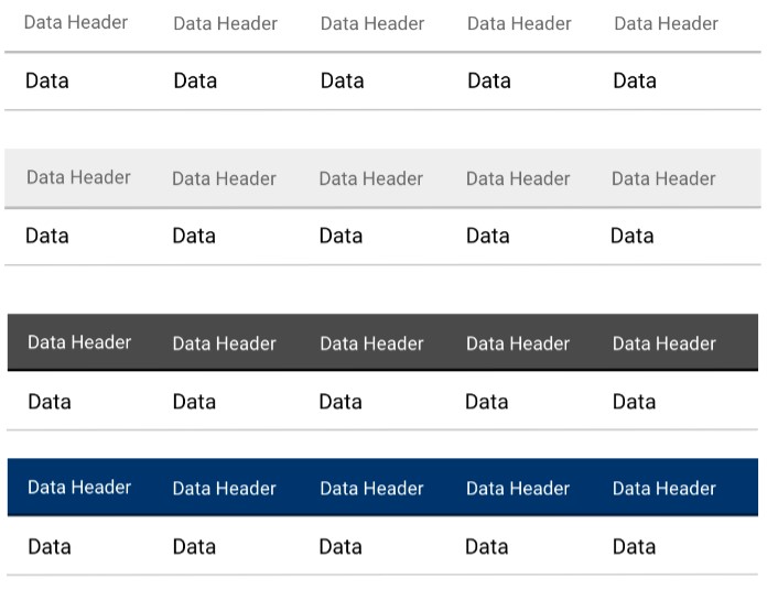
The default white header can be changed to light or dark.
Row Style
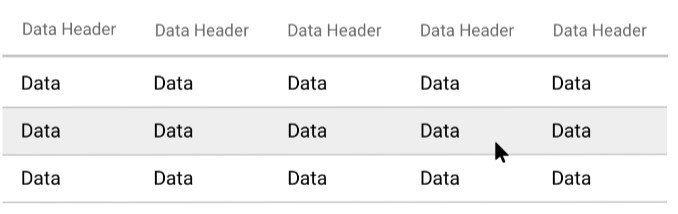
On hover, rows have a background highlight to help users focus on one row.
Pinned Header Option
The table header can be optionally pinned to the top of the view port. Use a drop shadow to indicate the z-axis.
Container Option
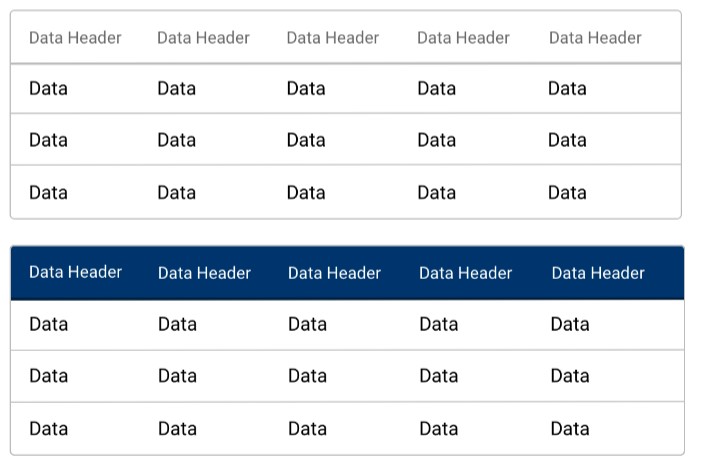
The entire table can be optionally displayed in a visible container with 4px rounded corners. For white, light, or dark headers.
Code
Default Table
Light Header Table
Dark Header Table
Color Header Table
Condensed Table
Sticky Header Table
Sorted Table
Paginated Table
Props
Table Props
| Name | Type | Default | Description |
|---|---|---|---|
paginated | boolean (optional) | false | Activates pagination for table rows. |
perPageOptions | array (optional) | [10, 25, 50] | Array of results per page options for table row pagination |
tableControls | jsx (optional) | null | Components to be placed in control area above table |
lightHeader | boolean (optional) | false | Activates light header styles. |
colorHeader | boolean (optional) | false | Activates color header styles. |
darkHeader | boolean (optional) | false | Activates dark header styles. |
headerSticky | boolean (optional) | false | Activates sticky header styles. |
condensed | boolean (optional) | false | Activates condensed cell padding. |
Table Head Cell Props
| Name | Type | Default | Description |
|---|---|---|---|
sort | boolean (optional) | false | Sets this column to be sortable. |
sorttype | string (optional) | "alpha" | Sets sort type for this column ("alpha" |
Table Row Cell Props
| Name | Type | Default | Description |
|---|---|---|---|
sortvalue | string (optional) | "" | Sort value for a cell (use is cells contents contain anything other than a plain string) |
Classes
th
| className | Description |
|---|---|
align-left | Sets column text alignment to left. |
align-center | Sets column text alignment to center. |
align-right | Sets column text alignment to right. |
actions | Adds special styles to action columns. |