Tabs
Usage
Definition
Tabs organize content within a category in a horizontal menu of logical subsections.
Each tab within a group contains a distinct subsection of content.
Common Characteristics
All tabs are presented horizontally and have ALL-CAPS labels. All tabs have a separator that spans the width of the content area governed by the tabs. Tabs have these states: selected, active, hover/tap, and focused. A Tab with no content must have explanatory text rather than left blank.
Usage Guidelines
The left-most tab is always pre-selected by default. Content within tabs must be peers related to the same parent category/topic/item. If necessary, tabs can scroll horizontally above the content they govern.
Tabs can scroll above the content if needed. Tabs with no content must have explanatory text. Click the second tab for an example.
Design
States
Tabs have these states: selected, active, hover/tap, and focused.
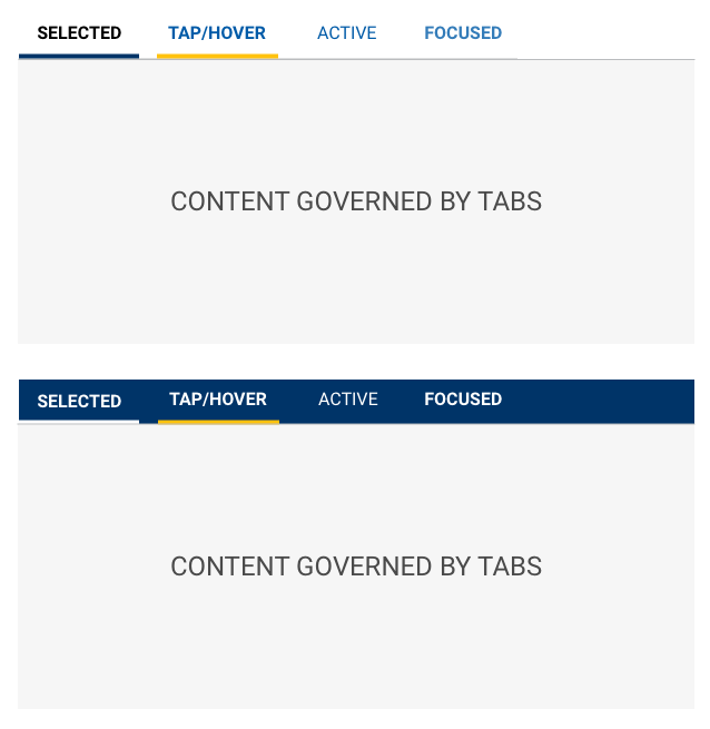
Tabs are left aligned with a visual separator that spans the width of the content governed by the tabs.
SCSS
Modifiers
| Name | Description |
|---|---|
| tab-light-bkg | Tabs on a Light Background |
| tab-dark-bkg | Tabs on a Dark Background |
| tab-icon-light-bkg | Icon Tab Bar (TOP) on a Light Background |
| tab-icon-dark-bkg | Icon Tab Bar (TOP) on a Dark Background |
| tab-icon-light-bkg-bottom | Icon Tab Bar (BOTTOM) on a Light Background |
| tab-icon-dark-bkg-bottom | Icon Tab Bar (BOTTOM) on a Dark Background |
Code
Tabs
Props on the Tabs component will apply to the entire collection. Props on the
TabPane will cascade to the Tab component and the underlying Action
component.
Tabs can have label and icons
Tabs can have either label and icons
Tabs can set textOnly or iconOnly
Tab Active
The active tab is set to zero (0) by default and can be set to any tab index.
Tab Color
Tabs can be used on light backgrounds
Tabs can be used on dark backgrounds
Tab Border
Tabs can be used with a border below the tabs
Tabs has a bottom border by default. This is controlled by a boolean property border
Tabs can be used without a border below the tabs
This is often used when using a dark background color.
Tabs can link externally
Tabs use Buttons under the hood allowing for an href to be provided as a link to an external page.
Tab content updates with changes
Tab generated from data prop
Tab generation from data prop can be dynamic
Tab Props
Tabs
| Name | Type | Default | Description |
|---|---|---|---|
| activeIndex | number | 0 | Sets the currently selected tab index (the first tab's index is zero (0)) |
| border | bool | true | Toggles the border below the tab buttons |
| className | string | String of classnames to add to the Tabs container | |
| color | "light" or "dark" | "light" | Sets color state of tabs. Must be either "light" or "dark" |
| data | array[dataShape] | null | Allows for tab construction via an object |
| iconOnly | bool | Sets the tab buttons to display only icon provided | |
| id | string | uuid() | String used as the id attribute of the Tabs container |
| onChange | func | Callback function for when the activeIndex is modified. Sends an object containing prevActiveIndex and activeIndex. | |
| size | "sm" or "md" | "md" | Sets the display size of the tabs. Must be either "md" or "sm" |
| textOnly | bool | Sets the tab buttons to display only text provided |
TabBar
| Name | Type | Default | Description |
|---|---|---|---|
| border | bool | true | Toggles the border below the tab buttons |
| className | string | null | String of classnames to add to the TabBar container |
| id | string | uuid() | String used as the id attribute of the TabBar container |
TabItem
| Name | Type | Default | Description |
|---|---|---|---|
| active | string | Sets the pane's active state | |
| addOnAppend | string | Icon name to display before the label | |
| addOnPrepend | string | Icon name to display after the label | |
| className | string | String of classnames to add to the TabPane container | |
| iconOnly | string | Sets the tab buttons to display only icon provided | |
| label | string | Text value to display | |
| onClick | string | Callback function for when the tab is acted upon. | |
| textOnly | string | Sets the tab buttons to display only text provided |
TabPane
| Name | Type | Default | Description |
|---|---|---|---|
| active | bool | false | Sets the pane's active state |
| className | string | null | String of classnames to add to the TabPane container |
| id | string | null | String used as the id attribute of the TabPane container |
| isAnimated | bool | true | Denotes if the panel ought to fade |
Data Shape
| Name | Type | Required? | Description |
|---|---|---|---|
| className | string | Classname for the TabPane | |
| content | string | Yes | TabPane content |
| disabled | bool | Selecting TabItem is disabled | |
| id | string | Id for the Tab | |
| label | string or {icon,text} | Text label for the TabItem or an object containing the icon and/or text label for the TabItem | |
| tabClassName | string | Classname for the TabItem | |
| tabId | string | Id value for the TabItem |