Indicators
Usage
Definition
Indicators are labels which convey small amounts of information such as a status, in a variety of visual forms, and can use color to communicate meaning.
Indicators have either one or two states, and may have an optional tool tip. They are not used to navigate to additional content.
Common Characteristics
All indicators have ALL-CAPS labels, or an icon.
All indicators are single-state (show/hide), or two-state (on/off).
Single-State Indicators
Single-state indicators are displayed in the UI when relevant, and hidden when not.
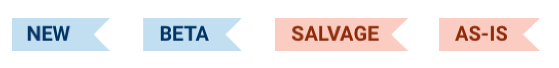
Flags
Flags are best used for words, not acronyms, and do not have tooltips.
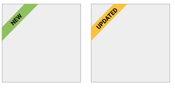
Flags can be displayed horizontally with content, or diagonally over content. Any single item may have up to two horizontal flags, and/or one diagonal flag.
 Flags can be used horizontally or diagonally
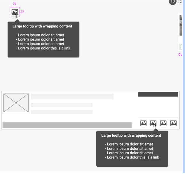
Icon Badges
Icon badges are visually identical to icon text buttons, but the only interaction is to display a tooltip on hover or tap.
Two-State Indicators
Two-state indicators have color when relevant, and gray when not.
Auction Lights
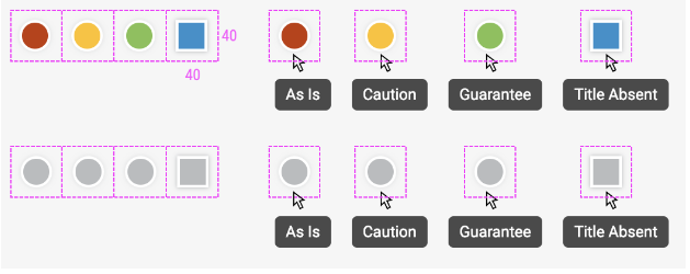
Auctions lights have tooltips in both on and off states.
Task Indicators
Task indicators indicate whether a task is complete or incomplete.
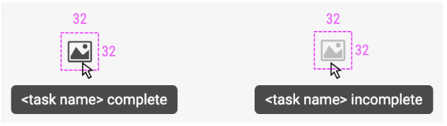
Task indicators have tooltips in both states.
Design
Single-State Indicators
Ribbons
 Corner Flags
Icon Badges
Two-State Indicators
 Auction Lights
Documentation
Color
| Class | Property |
|---|---|
.badge-primary | Applies primary button styles |
.badge-danger | Applies danger button styles |
.badge-danger-light | Applies danger-light button styles |
.badge-secondary | Applies secondary button styles |
.badge-secondary-light | Applies secondary-light button styles |
.badge-smoke | Applies smoke button styles |
.badge-gold | Applies gold button styles |
.badge-success | Applies success button styles |
Code
Ribbon Flags
Corner Flags
Two-state Indicators
Auction Lights
Task
Indicator Props
| Name | Type | Default | Description |
|---|---|---|---|
| id | string | null | Sets a unique id for an indicator |
| name | string | null | Sets the inline label text for a task indicator |
| label | string | null | Sets the label text for an indicator |
| type | string | null | Sets which type of indicator to use |
| tooltip | string | null | Sets the tooltip text for a task indicator |
| icon | string | null | Displays an icon next to the text for a task indicator |