Tooltips
Usage
Definition
Tooltips display text that describes an element or provides additional information. Tooltips can appear on hover, focus, or tap, and disappear after a short duration.
Common Characteristics
All tooltips are light text on a dark background and are normally positioned below the element they are paired with. They fade in and persist on hover or tap, and fade out off hover or another tap. Tooltips are stationary and do not follow the cursor.
Tooltip Basics
Tooltips come in two sizes: small and large. Small tooltips are always a single line of small, center-aligned text. Large tooltips have larger, left-aligned text that can wrap, and a pointer.
Interactivity
When a tooltip is paired with a functional element (e.g. a print icon, a linked avatar, etc), the tooltip is displayed on hover, but is ignored on tap. The tap executes the function instead of displaying the tooltip.
With non-functional elements (e.g. an info icon, etc), the tooltip is displayed on tap or on hover.
Small Tooltip
The small tooltip width varies with the center-aligned, 12px text plus 8px left/right padding up to a maximum of 200px. If a small tooltip won’t accomodate your text on a single line, use a large tooltip instead.
Functional Element
Functional elements will not show tooltips on touch devices.
Non-Functional Element
Large Tooltip
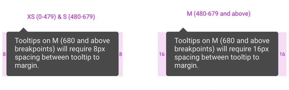
The large tooltip has a fixed 200px width, 16px left/right padding, and wrapping, left-aligned 14px text.
Functional Element
Functional elements will not show tooltips on touch devices.
Non-Functional Element
Typical Examples
Tooltips are commonly used with icon functions like print or close, or to provide contextual information.
Icon functions with small tooltips.
Functional elements will not show tooltips on touch devices.
Info icon with large tooltip
Avatar with small tooltip
Design
Code
Small Tooltip for Non-Functional Elements
Large Tooltip for Non-Functional Elements
Small Tooltip for Functional Elements
Functional elements will not show tooltips on touch devices.
Large Tooltip for Functional Elements
Functional elements will not show tooltips on touch devices.
Tooltip supports placement
To adjust the alignment of the arrow, Tooltip adds variation to the placement prop by adding -start and -end.
Tooltip with arrow styling
Delay before showing or hiding the tooltip
Disabled Tooltip
Tooltip without arrow
Tooltip Props
| Name | Type | Default | Description |
|---|---|---|---|
| className | string | "" | Adds additional classes to the tooltip |
| delay | number or object | 0 | Adds a delay to showing and hiding the tooltip on hover |
| disabled | boolean | false | Disables the tooltip from opening |
| hideArrow | boolean | false | Hides the arrow on the tooltip |
| isOpen | boolean | false | Sets whether the tooltip is shown or not |
| modifiers | array(object) | [] | Prop for any additional custom modifiers as specified by the react-popper library |
| placement | string | "bottom" | Sets the placement of the tooltip relative to its target. Supporting placements include auto,top,bottom,right,left. Append -start or -end to align the tooltip arrow. |
| size | string | "lg" | Sets size of the tooltip to either sm or lg |
| target | string, ref, or node | required (no default) | Associates the id of the element which triggers the tooltip |
| targetIsFunctional | boolean | false | Sets whether the element that triggers the tooltip also has an action associated to it |
| toggle | function | () => {} | Callback function when the tooltip is toggled |