Buttons & Button Groups
Buttons
Usage
Buttons allow a user to submit or request information, make decisions, and for navigation.
Button hierarchy is established by whether a button is contained (i.e. with a background color) for most emphasis, or outlined (no background) for less emphasis, or text only for the least emphasis.
Buttons may be normal (40px high) or small (32px). Full-screen width buttons are only allowed on the XS grid (0-479). In all other cases, button width is determined by the length of the label plus minimum L/R padding.
Common Characteristics
All buttons have bold, ALL-CAPS labels.
All buttons have these states: disabled, active, hover/tap, and focused.
Size
Buttons are normally 40px high, but a small 32px alternative may be used when vertical space is at a premium. Whichever size is used, use the same size for any associated elements like inputs and selects.
Special controls like the keyword search button, pagination controls, icon buttons, and menu buttons are always 32px high.
Hierarchy
Contained Buttons
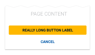
Contained buttons have the most emphasis and should be used for primary actions. When one button is needed (such as an “OK”) use a contained button.
An element cannot have more than one contained button.
Outlined Buttons
Outlined buttons provide less emphasis. When two or more buttons without hierarchy are needed, use multiple outlined buttons, or multiple text buttons.
Text Buttons
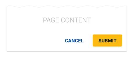
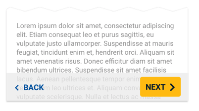
Text buttons have the least emphasis. When two buttons with hierarchy are needed (e.g. “SUBMIT” OR “CANCEL”), use a contained button for the primary action, and a text button for the secondary action.
When two or more buttons without hierarchy are needed, use multiple text buttons, or multiple outlined buttons.
Specialty Buttons
These buttons can be used in a UI in addition to the core button hierarchy.
Auxiliary Buttons
Auxiliary buttons are small, 24px high text buttons with short labels. They can be used with a left or right icon and have only 4px L/R padding. In narrow contexts where a user could take multiple actions, auxiliary buttons provide button functionality without a heavy footprint.
Example uses for Auxiliary buttons
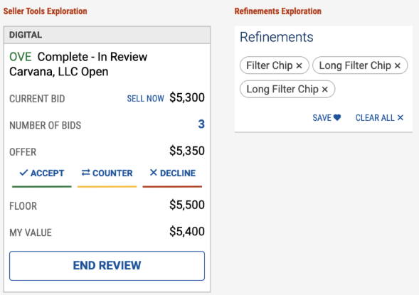
Auxiliary Buttons used in Seller Tools concept, and Search Results filters.
Floating Action Buttons
Floating Action Buttons allow a user to initiate an action related to the displayed content. They are contained buttons which are anchored in place above the content using the z-axis.
Floating action buttons can initiate an action or display a menu of actions to the user.
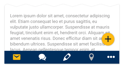
A contained button may be modified to create a floating action button. The floating action button can overlay content and is locked to a specific position in the lower right of the screen.
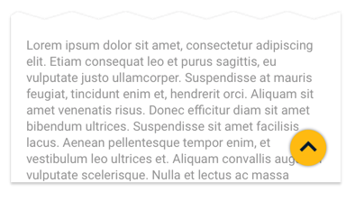
A floating action button can be used to scroll the user to the top of a screen. In this case, the button is hidden until the user has scrolled down 2x the height of the window.
Scenarios
Single Button
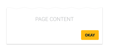
When a single button is needed, use a contained button.
Two Buttons with Hierarchy
Two Buttons without Hierarchy
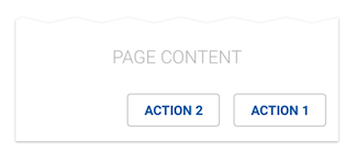
When two or more buttons without hierarchy are needed, they may be outlined buttons or text buttons, but cannot be contained buttons.
Anchored Buttons
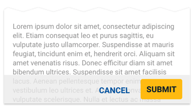
Buttons can be optionally anchored to the bottom of the screen on a semi-transparent action bar.
The text button can be optionally floated to the left.
When stacking buttons, the higher priority button (if any) goes on top.
Menu Bars
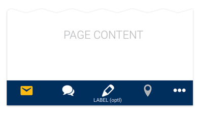
Text Icon buttons may be modified to create a mobile menu bar. Small text labels are optional if needed.
Design
Basics
All buttons have bold, ALL-CAPS labels and specified minimum left and right padding.
Hierarchy
Contained Buttons
Contained buttons have a background color to provide the most emphasis. Outline buttons have no background color, and thus have less emphasis. Text buttons have no background and no outline, and thus have the least emphasis.
See Button Usage for button type rules and scenarios.
With Icons
Buttons may have an optional left or right icon. Never use two icons.
States
Contained Button States
Outline Button States
Outline Button States (Light)
Text Button States
Text Button States (Light)
Auxiliary Buttons
SCSS
Use these modifiers with .css-className
Color
| Class | Property |
|---|---|
.btn-primary | Applies primary button styles |
.btn-secondary | Applies secondary button styles |
.btn-danger | Applies primary button styles |
.btn-success | Applies secondary button styles |
.btn-simulcast | Applies simulcast button styles |
Size
| Class | Property |
|---|---|
| .btn-sm | Applies small button styles |
Type
| Class | Property |
|---|---|
| .btn-outline-{color} | Outlined Button |
| .btn-textonly-{color} | Text-Only Button |
| .btn-icon-only | Icon-Only Button |
| .disabled, :disabled | Disabled Styles |
| .btn.dropdown-toggle | Dropdown Button |
| .btn-floating | Floating Button |
| .btn-pagination | Pagination Button |
| .btn-auxiliary | Specialty Button |
Code
In regular markup, using the .btn class without a modifier will create a contained button. The .btn class can be used on <button>, <a>, or <input> elements. Links should be assigned a role="button" attribute.
With React, the Button component can apply branded styles by padding properties. Theming is available with color (string), size (string), variant(string), icononly(bool), and disabled (bool).
Contained Buttons
Icons can be added before or after text.
Outlined Buttons
For outlined buttons, add a .btn-outline-*** modifier followed by color.
With React, pass the outline value for variant prop to the Button component. This will apply required styles, so it is not necessary to pass a color prop.
Text Buttons
With React, pass the textonly value to variant prop to the Button component. This will apply required styles, so it is not necessary to pass a color prop.
Alternative Button styles
Auxiliary Button
Action Link Button
Action links are text links that appear as an anchor but perform an action rather than direct the browser to a new URL via an href.
Floating Action Buttons
A contained button may be modified to create a floating action button by using the floatingAction value for variant prop.
The floatingAction button accepts primary or secondary color styles via the color prop. The textonly or outline values cannot be used in conjunction with the floatingAction value for variant prop.
Only one floatingAction button can be used on a single page.
Props
| Name | Type | Default | Description |
|---|---|---|---|
| color | string | "Primary" | Sets the button styles to either Primary or Secondary |
| size | string | "lg" | Set the button size to either small 'sm' or large 'lg' |
| active | bool | true | Set the active state a button |
| disabled | bool | true | Disables button and applies disabled styles |
| icononly | bool | false | Sets styles for icon-only buttons |
| close | bool | false | For use with toggle close buttons |
| onClick | function | null | Sets a custom onClick function |
| variant | string | null | Use outline, textonly, actionLink, aux, floatingAction values for variant prop |
Button Groups
Usage
Definition
Button Groups allow a user to select one item from a small set of options. They can be used as toggles, as scoping controls, and as a substitute for radio buttons, or tabs.
Full-screen width button groups are optionally allowed on the XS grid (0-479). In most cases, button groups should only be as wide as the labels plus minimum left/right padding demand.
Common Characteristics
All button groups have bold, ALL-CAPS labels.
The button on the left is always pre-selected by default.
Buttons in a group have these states: active, focused, hover/tap, and selected.
Size
Button Groups are normally 40px high, but a small 32px alternative may be used. Whichever size is used, use the same size for any associated elements like text inputs.
Labels should be as short as possible and each button in a group should be the same width. If this can’t be achieved because of varied label lengths, consider using a different control.
Scenarios
Using as a Toggle

Button Groups used as View and Sort controls. Always pre-select the most common option on the left.
Using as a Scoping Control
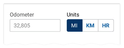
A button group used to scope another control Always pre-select the most common option on the left. A button group label is optional.
Using as Radio Buttons
Always pre-select the most common option on the left. A button group label is optional.
Replacing Tabs
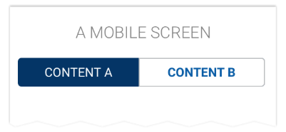
A button group can be used as tabs on mobile apps.
States
Buttons in a group have these states: active, focused, hover/tap, and selected.
Size
Button Groups are normally 40px high, but a small 32px alternative may be used. Whichever size is used, use the same size for any associated elements like text inputs.
Labels should be as short as possible and each button in a group should be the same width. If this can’t be achieved because of varied label lengths, consider using a different control.
Full-screen width button groups are optionally allowed on the XS grid (0-479). In most cases, button groups should only be as wide as the labels plus minimum left/right padding demand.
A normal size button group with varying labels
A small button group
Code
Toggling Items
Controlled State
Group sizing
Props
ButtonGroup
| Name | Type | Default | Description |
|---|---|---|---|
| tag | custom | "div" | Sets the element type for the button group container |
| role | string | "group" | Sets the button group container's role attribute for browser accessibility |
| aria-label | string | null | Sets the button group container's aria-label attribute which is used in cases where a text label is not visible on the screen. |
| className | string | null | Sets a custom class on the button group container element |
| vertical | boolean | false | Displays the button group buttons vertically |