Checkboxes
Usage
Definition
Checkboxes allow a user to select one or more items from a list of options. For unusually long lists which must be contained inside a scrollable area, combine checkboxes with a text search to help users more easily find the desired options.
Avoid using single checkboxes (exception: “Remember username” function in sign in forms).
Common Characteristics
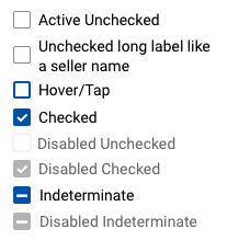
All checkboxes allow the user to tap the checkbox or associated label. The label is vertically centered with the checkbox even when the text wraps. Checkboxes should normally be active and unchecked by default.
Checkboxes buttons have these states: active unchecked, or hover/tap, or checked, or indeterminate; and disabled unchecked, or checked, or
Scenarios
Horizontal
When necessary to use a horizontal layout, ensure there is at least 32px space between each checkbox/label element.

Nesting
In nested layouts, selecting a parent checkbox implies the selection of all its children, even though the child text boxes are not displayed as selected. Selecting any one child checkbox implies the selection of its parent, even though the parent is not displayed as selected.
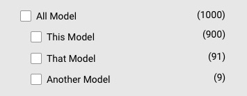
With Filter Counts
When using checkboxes as filters with counts, right align the counts.
States
Checkboxes buttons have these states: active unchecked, or hover/tap, or checked, or indeterminate; and disabled unchecked, or checked, or indeterminate.
Code
Default Uncontrolled Checkbox
The Checkbox component is now uncontrolled. It will take a checked prop, but is rendered as defaultChecked.
Default Controlled Checkbox
Disabled Checkbox
Indeterminate Checkbox
Checkboxes Props
| Name | Type | Default | Description |
|---|---|---|---|
| checked | bool | false | Sets the checked state of the checkbox |
| className | string | null | Sets a custom class name on the checkbox |
| disabled | bool | false | Disables checkbox and applies disabled styles |
| label | string | null | Sets the label text shown next to the checkbox |
| name | string | null | Sets the name attribute of the checkbox to make it unique |
| required | bool | false | Sets whether or not the checkbox is required |
| value | any | null | Sets the value of checkbox when selected |
| onChange | function | null | Sets the function to be called when a checkbox is checked or unchecked |