Chips
Usage
Definition
Chips are small elements which present small amounts of information or offer optional actions.
Common Characteristics
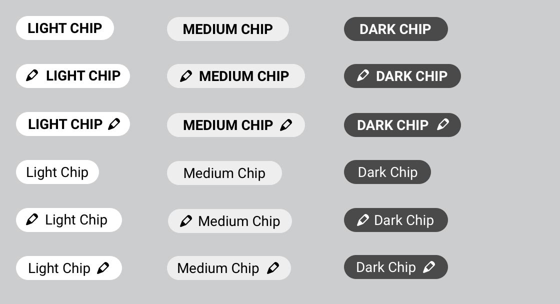
All chips have a background color, and are 24px high. They have 8px left and right padding unless this is increased to achieve a 40px minimum width.
Chips labels may be bold ALL-CAPS, or regular sentence case. Maintain a minimum of 4px space between chips vertically and horizontally.
Basic Chips
Chips may be dark, medium, or light.
Transparent Chips
Chips can be marked as transparent. Background colors will become transparent while additional stylings remain unchanges. This is useful for working with dark backgrounds.
Chips with Tooltips
Chips can have an optional tooltip that displays on hover/tap.
Color can be used to indicate higher urgency.
Actionable Chips
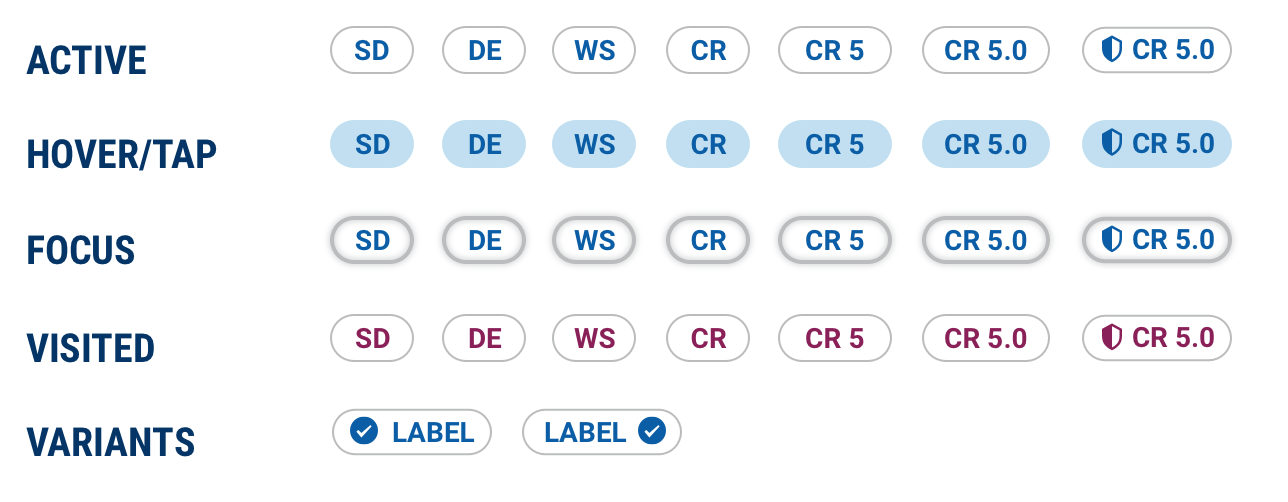
Chips can be used to navigate to more content.
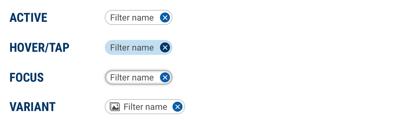
Filter Chips
With icon variant
Chips can optionally be prepended AND/OR appended with any of the Prism icons.
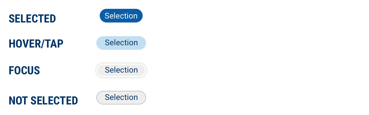
Selection Chip
Selected
Chips can be used to select options from a group. Note the sentence case labels.
Design
Basic Chips
Actionable Chips
Filter Chips
Selection Chips
Code
Basic Chips
Actionable Chips
Actionable chips are created by providing a type="action" prop.
Providing a wrapper anchor tag with an href will allow the chip to take the user to the provided URL.
Chips with Tooltips
Chips Props
| Name | Type | Default | Description |
|---|---|---|---|
| color | string | "medium" | Sets the chip color to either light, medium or dark |
| label | string | null | Displays label text displayed inside the chip |
| iconBefore | string | null | Displays an icon before the chip label text |
| iconAfter | string | null | Displays an icon after the chip label text |
| bold | boolean | false | Sets the chip label text to display as bold |
| uppercase | boolean | false | Sets the chip label text to display as uppercase |