Usage Definition Cards provided a visible, unifying container for content and related
actions.
Cards are flexible. They can contain text, media, dynamic data, design
elements, UI controls, or actions. Cards are usually interactive and
may contain multiple related actions.
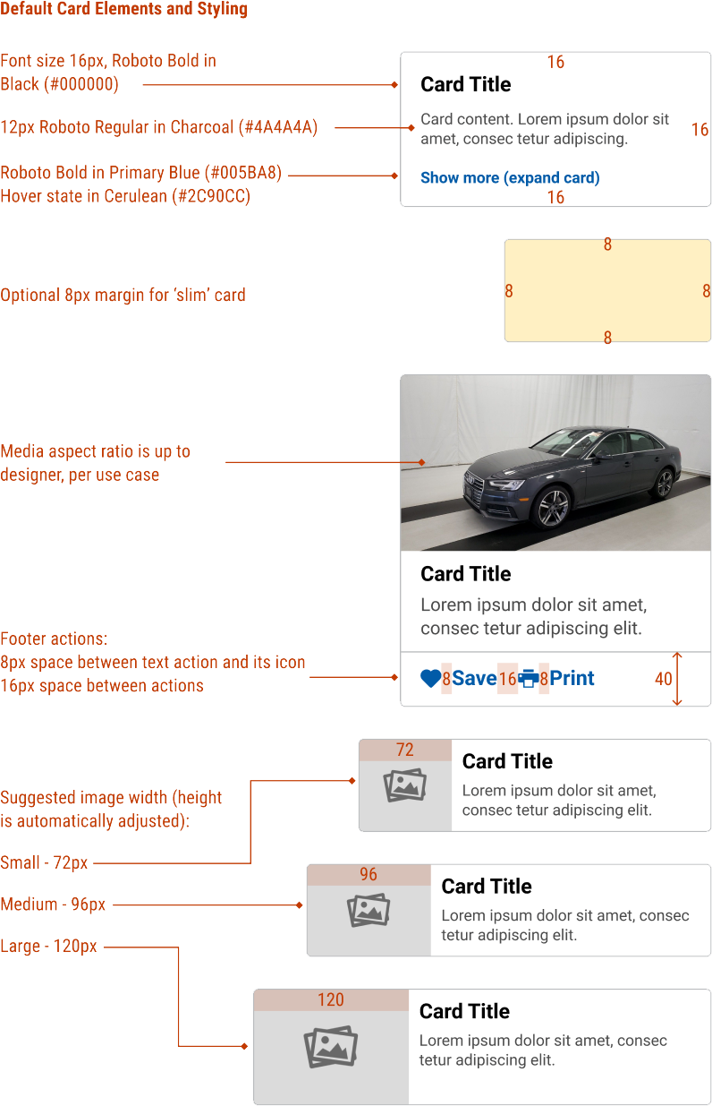
Common Characteristics All cards have a rectangular container with a solid background and 4px
rounded corners. The minimum height and width is 80px x 80px.
Cards may be any height and width needed (subject to minimums), and
any aspect ratio needed.
Flexible Content Cards are intentionally flexible to allow designers to display content as
needed. Cards may include headings, text, dynamic data, interactive
elements, and other PRISM components.
Default Elements White background 1px, smoke (#babcbe) stroke 16px minimum padding on all sides Options Default elements can be changed and additional elements added as
needed. Designers and developers can optionally:
Change the default background color Change the default stroke color Hide the stroke Change the minimum padding to 8px for slim cards. Add a 40px high footer for one or more Actions (text, icons, or both) Add media: top-aligned, left-aligned, or as a background Media can have an optional margin Cards may have an optional footer. The footer has the following defined
rules:
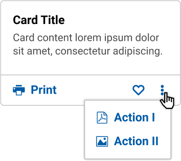
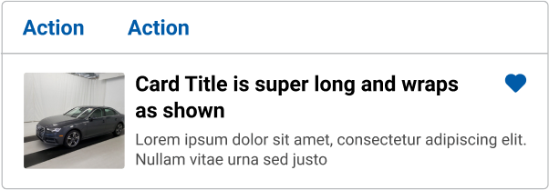
40px tall and the same width as the card body Separated from the card body by a divider Can only contain Actions (text, icons, or both) Text Actions are anchored to the left Icon Actions are anchored to the right Actions can be nested in a menu Examples See the Design tab for examples
Do
Don't
Code Basic Usage Examples ( ) => {
const [ isOpen , setIsOpen ] = React . useState ( false ) ;
const handleMoreClick = ( ) => {
setIsOpen ( ! isOpen )
}
return (
< Card title = " Card Title1 " >
< p > Lorem ipsum dolor sit amet, consec tetur adipiscing elit. </ p >
< Button variant = " actionLink " onClick = { handleMoreClick } > Show { isOpen ? "less" : "more" } ( { isOpen ? "collapse" : "expand" } card) </ Button >
{ isOpen ? (
< div className = " mt-2 " >
< p > Lorem ipsum dolor sit amet, consec tetur adipiscing elit. </ p >
</ div >
) : null }
</ Card >
)
}
( ) => {
const [ isOpen , setIsOpen ] = React . useState ( false ) ;
const handleMoreClick = ( ) => {
setIsOpen ( ! isOpen )
}
return (
< Card title = " Card Title " >
< p > Lorem ipsum dolor sit amet, consec tetur adipiscing elit. </ p >
< Button variant = " actionLink " onClick = { handleMoreClick } > Show { isOpen ? "less" : "more" } ( { isOpen ? "collapse" : "expand" } card) </ Button >
{ isOpen ? (
< div className = " mt-2 " >
< p > Lorem ipsum dolor sit amet, consec tetur adipiscing elit. </ p >
</ div >
) : null }
</ Card >
)
}
Card with Tabs < Card gutter = " none " >
< Tabs >
< TabPane label = " One " addOnPrepend = " bell " >
Aliquam maximus sollicitudin orci, et iaculis velit scelerisque vel. Etiam sagittis mi facilisis eleifend sodales. Lorem ipsum dolor sit amet, consectetur adipiscing elit. Aliquam erat volutpat.
</ TabPane >
< TabPane label = " Two " addOnPrepend = " bell-o " >
Proin dui orci, efficitur eu sem id, rutrum aliquam enim. Suspendisse congue aliquam felis eget tristique.
</ TabPane >
</ Tabs >
</ Card >
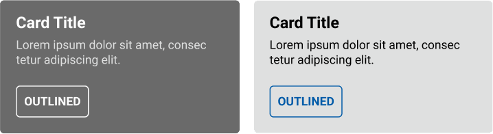
Dark Variant < Card dark title = " Card Title " >
< p > Lorem ipsum dolor sit amet, consec tetur adipiscing elit. </ p >
</ Card >
< Card dark title = " Card Title " >
< p > Lorem ipsum dolor sit amet, consec tetur adipiscing elit. </ p >
< Button className = " text-white border-white " variant = " outline " > Outlined </ Button >
</ Card >
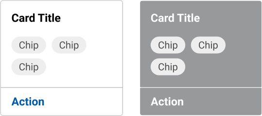
Multiple Cards < >
< Card actions = { { left : [ { label : 'Action' } ] } } width = { 150 } title = " Card Title " >
< Chip color = " medium " > Chip </ Chip >
< Chip color = " medium " > Chip </ Chip >
< Chip color = " medium " > Chip </ Chip >
</ Card >
< span className = " pl-2 " />
< Card dark actions = { { left : [ < Action label = " Action " title = " Card Title " key = " ex-act-left-on-dark " /> ] } } width = { 150 } border = { false } title = " Card Title " >
< Chip > Chip </ Chip >
< Chip > Chip </ Chip >
< Chip > Chip </ Chip >
</ Card >
</ >
Actionable Cards < Card
media = " https://picsum.photos/id/1072/200/150 "
actions = { { media : [ { addOnPrepend : 'heart' , label : 'Like' } ] } }
/>
< Card
media = " https://picsum.photos/id/1072/200/150 "
actions = { { media : [ { addOnPrepend : 'heart' , label : 'Like' } ] } }
mediaContent = " Here is some text "
/>
< Card
media = " https://picsum.photos/id/1072/200/150 "
actions = { { media : [ { addOnPrepend : 'heart' , label : 'Like' } ] } }
mediaContent = " Here is some text "
/>
No Border < Card
border = { false }
media = " https://picsum.photos/id/1072/200/150?grayscale&blue=3 "
/>
< Card
actions = { { left : [ { label : 'Action' } , { label : 'Action' } ] } }
media = " https://picsum.photos/id/1072/200/150 "
title = " Card Title "
width = { 200 }
>
< p > Lorem ipsum dolor sit amet, consec tetur adipiscing elit. </ p >
</ Card >
< Card
actions = { { left : [ { addOnPrepend : 'heart' , label : 'Like' } ] } }
className = " border-dark "
media = " https://picsum.photos/id/1072/300/225 "
mediaGutter = " full "
>
< p > < small > Data · Data · Data · Data </ small > </ p >
< Button variant = " outline " > Outlined </ Button >
< span className = " pl-3 " />
< Button variant = " outline " > Outlined </ Button >
</ Card >
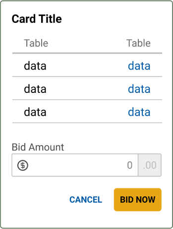
< Card className = " border-success " title = " Card Title " >
< table className = " table " >
< thead > < tr > < th > Table </ th > < th > Table </ th > </ tr > </ thead >
< tbody >
< tr > < td > data </ td > < td > data </ td > </ tr >
< tr > < td > data </ td > < td > data </ td > </ tr >
</ tbody >
</ table >
< FormGroup >
< Input.Label size = " sm " > Small </ Input.Label >
< Input
size = " sm "
type = " text "
className = " form-control "
/>
</ FormGroup >
< div className = " text-right " >
< Button variant = " textonly " > Cancel </ Button >
< Button color = " primary " > Bid Now </ Button >
</ div >
</ Card >
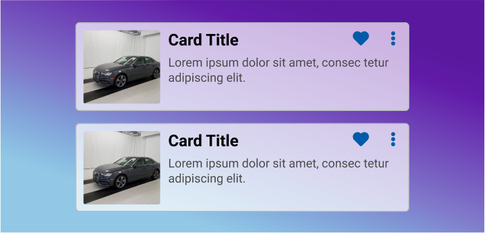
Horizontal < Card media = " https://picsum.photos/id/1072/200/150 " title = " Card Title " horizontal >
< p > Lorem ipsum dolor sit amet, consec tetur adipiscing elit. </ p >
</ Card >
More Examples < Card
actions = { { left : [ { label : 'Action' } ] } }
media = " https://picsum.photos/id/1072/200/150 "
title = " Card Title "
horizontal
>
< p > Lorem ipsum dolor sit amet, consec tetur adipiscing elit. </ p >
</ Card >
< Card
actions = { { body : [ { label : 'Action' , addOnAppend : 'heart' } , { label : 'Action' , addOnAppend : 'heart' } ] } }
media = " https://picsum.photos/id/1072/200/150 "
mediaGutter = " thin "
title = " Card Title "
horizontal
>
< p > Lorem ipsum dolor sit amet, consec tetur adipiscing elit. </ p >
</ Card >
< Card
actions = { { body : [
{ label : 'Action' , addOnAppend : 'heart' } ,
{ label : 'Action' , addOnAppend : 'heart' } ,
] } }
media = " https://picsum.photos/id/1072/200/150 "
mediaGutter = " thin "
title = " Card Title "
horizontal
>
< p > Lorem ipsum dolor sit amet, consec tetur adipiscing elit. </ p >
</ Card >
< Card horizontal media = " https://picsum.photos/id/1072/200/150 " title = " Card Title " mediaGutter = " thin " actions = { { body : [
{ label : 'Action' , addOnAppend : 'heart' } ,
{ label : 'Action' , addOnAppend : 'heart' } ,
] } } >
< p > Lorem ipsum dolor sit amet, consec tetur adipiscing elit. </ p >
</ Card >
< Card title = " Outer Card " gutter = " thin " >
< div className = " d-flex flex-row justify-content-around " style = { { gap : '0.8rem' } } >
< Card title = " Card 1 " width = { 150 } actions = { { left : [ { label : 'Left Action' , addOnPrepend : 'camera' } ] } } />
< Card title = " Card 2 " width = { 150 } media = " https://picsum.photos/id/1072/150/100 " />
< Card title = " Card 3 " width = { 150 } actions = { { right : [ { label : 'Right Action' , addOnPrepend : 'alarm-add' } ] } } />
</ div >
</ Card >
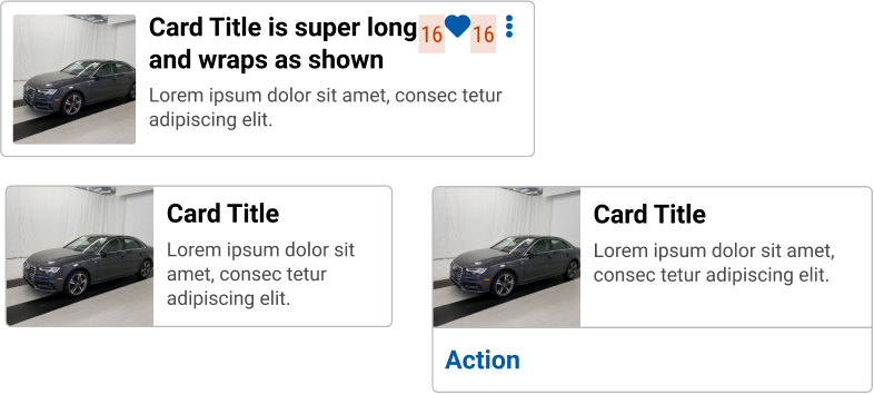
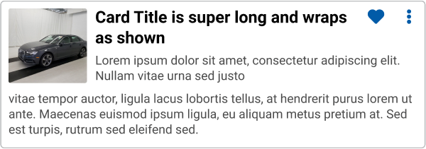
Design Card Anatomy Card titles are always left-aligned. Titles should always be the largest
size font on the card. Minimum font size for a card title is 14px.
Body text should be smaller and in lighter color than the title. The
default font is Roboto in Charcoal (#4A4A4A). If there is linked text in
the body, follow PRISM link styling standards.
Variable Elements Width/height (subject to minimums), aspect ratio Content, data, controls, actions Text Actions can be nested in a menu Text Actions can have an icon Icon Actions can be nested in a menu A footer can contain both text and icon Actions Examples Examples below are meant to illustrate intended flexibility of the
[UX Specification][#design], rather than prescribe, coded solutions.
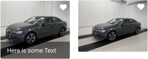
A card can have an image overlay with a minimum height and minimum width of 80px
In a horizontal card, media takes up 30% of the card. Keep the content and
actions item succinct and not overcrowded.
White is the default background color for the card, and can be changed to
other background fill. Maintain a good legibility between background fill
and content element.
Card with a table design, currency input, and buttons.
Card with chips and footer action
Avoid
Overloading cards with too many details
Transparent or semi-transparent background
Wrapping text around media
Inconsistent padding
Swapping the position of the footer