Modal
Usage
Modals are child windows which appear in front of the main window to provide urgent information, or ask for information, or ask for a decision while keeping the user's current context. Modals demand a user's attention and must be acted upon or dismissed before a user can continue working in the main window.
Modals are disruptive and can annoy users. Therefore, they should be used sparingly and kept brief, without multiple steps. They should be user initiated unless an urgent system message needs to be seen and acknowledged.
Common Characteristics
All modals appear on a 50% opacity black background, and will contain content plus an action. Modals may only have one or two actions. Headings are optional.
Users may close any modal by clicking on the main window, or keyboard ESC, or “X”, or an action button.
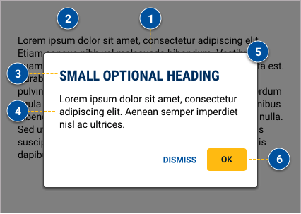
Modals are centered with the main page and appear near the top of the main page—80px from the top for XS, S, and M breakpoints; and 120px from the top for L, XL, and XXL breakpoints.
Large modal with a confirming and dismissing actions.
Usage Guidelines
Modals are disruptors which are known to annoy users in many cases, so use them sparingly. Only use modals for brief processes when maintaining the user's current context is important. For long processes with multiple steps or options, consider a new page or full-page overlay.The optimal use cases for modals are:
Modals should only include one or two actions. If one, it must be an acknowledgement action (e.g. “OK”). If two, one must be a confirming action, and the other a dismissing action. (e.g. “SUBMIT” and “CANCEL”).
Small modal with an acknowledging action.
Small modal with an acknowledging action and header.
Interaction
When a modal is open, all functionality on the main window should be disabled including scrolling. Also, avoid scrolling content within a modal. If scrolling can't be avoided, lock the action buttons in view.
Accessibility
When opening a modal, save the last element interacted with in the main window. Move keyboard focus to the modal, and trap focus in the modal until it is dismissed. When the user closes a modal, keyboard focus should be restored to the element that opened the modal, not to the top of the page. Allow the user to dismiss a modal using the keyboard's ESC key, or by clicking the main window, or by clicking close (“X”).
Resources
- Best Practices for Modals / Overlays / Dialog Windows
- 10 guidelines to consider when using overlays / modals
- Design Patterns for Replacing Modal Windows
- Bootstrap modal documentation
- Google Material dialog documentation
Design
Anatomy
- All modals have a stroke, drop shadow, and rounded corners.
- The background opacity is 50% of #000000.
- Headings are optional.
- Content.
- “X” only appears on the large modal.
- One or two buttons only. If two buttons, there must be a confirming contained button, and a dismissing text button.
Sizes
Large
Large modals are 90% of browser width up to 640px maximum, and up to 80% of main window height. These can be used in all breakpoints. However on the XS (0-479) breakpoint, it is rendered as a slide up, full-screen overlay.
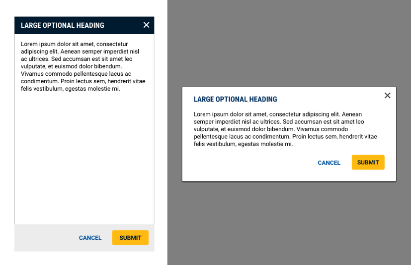
Large modals convert to a slide-up, full-screen overlay on the XS breakpoint.
Small
Small modals are 90% of browser width up to 320px maximum. Height varies to fit the content. Styling is the same for all breakpoints.
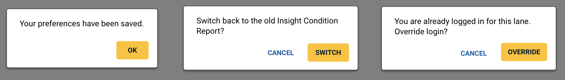
In two button scenarios, the confirming action should reflect the specific action being taken, rather than a generic “OK” label.
Code
Default Modal
Modal Without a Heading
Small Modal
Small Modal With Header
Props
Modal Props
| Name | Type | Default | Description |
|---|---|---|---|
| isOpen | boolean | false | Sets whether the modal is shown or hidden |
| toggle | function | null | Sets the function called when the modal is toggled |
| size | string | "lg" | Sets the size of the modal to sm or lg |
ModalCancel Props
| Name | Type | Default | Description |
|---|---|---|---|
| onClick | function | null | Sets the function called when the modal cancel button is clicked |
ModalOkay Props
| Name | Type | Default | Description |
|---|---|---|---|
| onClick | function | null | Sets the function called when the modal okay button is clicked |