Radio Buttons
Usage
Definition
Radio buttons allow a user to select one item from a short list of two to four options. For single selection of five or more options, use a dropdown or select list instead.
For a single option, use a switch instead. For small screen applications avoid radio buttons and use a button group or custom select list instead.
Avoid nesting radio buttons.
Common Characteristics
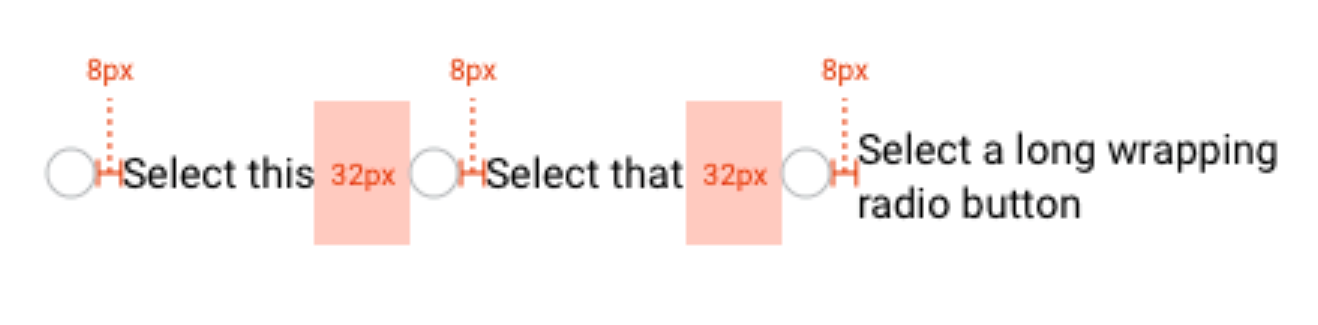
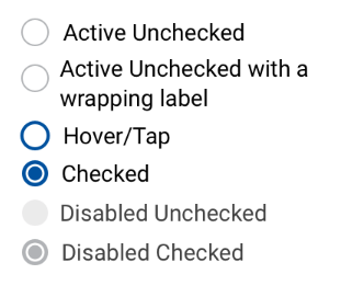
All radio buttons allow the user to tap the radio button or its associated label. The label is vertically centered with the radio button even when the text wraps. Radio buttons should normally be active and unchecked by default.
Radio buttons have these states: active unchecked, or hover/tap, or checked; and disabled unchecked, or checked.
Scenarios
Horizontal
When necessary to use a horizontal layout, ensure there is at least 32px space between each radio button/label element.
Filter Counts
When using radio buttons as filters with counts, right align the counts.
Design
States
Radio buttons have these states: active unchecked, or checked, or hover/tap; and disabled unchecked, or checked.
Code
Active
Disabled
Radio Button Props
| Name | Type | Default | Description |
|---|---|---|---|
| value | string | null | Sets the value of the selected radio button |
| label | string | null | Sets the label text to the right of the radio button |
| counts | string | null | Optional counts shown to the far right of the label text |