Interstitial
Usage
The Interstitial with Spinner component shows a user that the system is working to perform a requested action. It can be used for full page loads or for individual components.
All interactions are disabled within the container in which the interstitial appears, whether an entire page, or content block, or button. The component does not indicate progress, so engineering teams must determine the appropriate timing for an error state in their application should the request fail.
States
The component includes these states: Active, TimedOut, Static. See the Design Tab above for visual design details.
- Active - This state displays a spinner with custom text after a 250ms delay. The delay can be adjusted from zero to two seconds as needed.
- Timed Out - This non-animated state is displayed five seconds after the active state per WCCAG 2.2.2 recommendations.
- Static - This non-animated state displays an alternate icon to users who deactivate animation in their browser settings.
Variants
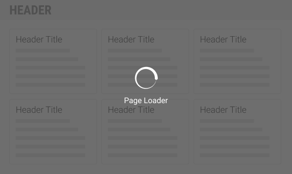
Full Page
By default, the full page variant is white on an 80% opacity
charcoal (#4a4a4a) background, but can be chaned to charcoal on 80% white
(#ffffff). The entire page is disabled until content is refreshed. Use this
variant when loading or refreshing an entire page.
Content Block
By default, the content block variant is charcoal on an 80% opacity white, but can be changed to white on 80% charcoal. The content block (e.g. a card, modal , container, or page section) is disabled until content is refreshed. Use this variant when loading or refreshing content within a specified container.
Component
This variant does not have an opacity. Use this variant with a button to indicate the system is working on the user request, or with certain inputs (dropdowns, autocompletes, etc) to indicate that content is being retrieved. The text associated with the button or input replaces the need for text within the interstitial itself.
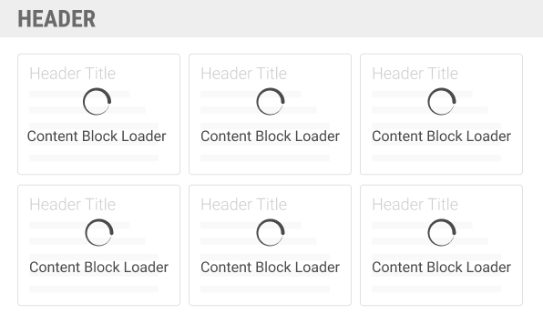
A single full page loader is preferred over multiple content block loaders when a consistent lag is anticipated.
Usage Guidelines
Do
Build fast applications that minimize the need for the interstitial.
Adjust the 250ms delay as needed (Consult with your UX partner).
Display the appropriate interstitial variant – whether page, or content bloc, or component.
Use appropriate, on-brand labels for each state and variant.
Plan for an error state if the loading function fails.
Don't
Don't display overlapping interstitial variants simultaneously. For example, don't display a content block interstitial and a full page interstitial at the same time.
Don't use the interstitial for visual interest.
Don't forget time-out and error considerations.
Design
Sizes
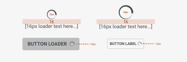
Full Page: Icon is 48px with 16px Roboto text
Content Block: Icon is 32px with 16px Roboto text
Component: Interstitial is 16px for M component (buttons, dropdowns, input lists, etc) and 12px for S components.
 )
)Colors/Fonts
The Full Page interstitial is white on an 80% opacity charcoal (#4a4a4a) by default, but can be switched to charcoal on 80% opacity white.
The Content Block interstitial is charcoal (#4a4a4a) on 80% opacity white by default, but can be switched to white on 80% white opacity.
When the interstitial appears on buttons, the button ought to be disabled, with the addition of the interstitial either left or right aligned.

The page interstitial defaults to white on dark, but can be reversed.

The content block interstitial defaults to charcoal on light, but can be reversed.
Static Alternative
After 5 seconds, the animated interstitial is replaced with a static glyph. This version is also used if the user has animations turned off in their browsers.
For accessibility, be sure to tag the alt text correctly to match the displayed text.
Code
Interstitial adheres to the ADA visualization standards of displaying after
2 seconds as either the spinner or a static glyph and change the initial state
(spinner or static glyph, and label) to the adaTimeout* alternates after
5 seconds as per the standard. Please see examples below for details.
Inline Display
The interstitial component can be used to indicate the component is busy with
a task, such as a form submitting. To do so, simply provide an inline prop and
place within the input or the disabled submit button.
Block Level Display
The interstitial component can be used to block content to indicate it is busy
with a process. This is done by passing a ref or DocumentElement as the
target prop.
The target can be any element in the document, see React Portal for container limitations and restrictions.
Or on the form as could help the first example.
Notice how the interstitials (input and button) "underneath" the form's interstitial are hidden. This is visually handled with CSS and does not interfere with other states or timers.
Fullpage Display
Covering the full page is done the same as any other container, mechanically at
least. The color prop needs to be set to 'dark' (per spec) and the target
needs to be set to the document.body.
Customizing the Label
A label can be provided by using the label prop. After 5 seconds, the
label (and glyph) will change to the ADA final state.
Customizing the Icon
Initially, the interstitial starts in the animated state displaying an
@prism/spinner component. Depending on the use case and the browser/device
specifications, the spinner can be disabled using a isStatic prop.
The ADA icon and label can be changed for the changed using the provided props.
Static and spinner interstitials will change to the final glyph and label
determined by the adaTimeoutGlyph and the adaTimeoutLabel props.
Using with Images
By attaching state to even listeners, we can display an interstitial while
the image changes. (displayDelay is reduced here for example purposes.)
Props
| Name | Type | Default | Description |
|---|---|---|---|
| adaTimeoutAfter | number | 5000 | Time delay from the display firing to landing in the final, ADA state |
| adaTimeoutGlyph | string | 'clock' | Graphical icon to show when in final state |
| adaTimeoutLabel | string | 'One Moment' | Text string to show when in final state |
| className | string | Adds to the classname of the outter container | |
| color | string | 'dark' | Denotes the text color (mask color is "opposite"). |
| displayDelay | number | 2000 | Time between mounting the component before component items are visible. |
| glyph | string | 'clock' | Graphical icon to show when in a static state |
| inline | bool | false | Disables the mask and label, leaving only the glyph |
| isActive | bool | true | Enables the interstitial |
| isStatic | bool | false | Uses a static IconSvg element instead of Spinner using the glyph prop |
| label | string | 'Loading' | Text string to show when spinning or active |
| size | string[xs, sm, md, lg, xl, xxl] | 'md' | Determines the size of the spinner and the glyphs |
| target | oneOf[ref, node] | Element into which the interstial (mask and content panel) will mount (append) |