DataTable
Usage
The responsive Data Table organizes data to help users quickly scan and compare information and take actions on any size screen. On wider screens, traditional header sorting is provided. A small screen adaptive layout removes the header row and provides an alternative Single Sort component.
The Data Table is primarily for single lines of data but can be adjusted to accommodate block list data and paragraphs.
Common Characteristics
The Data Table is built with these default properties:
- Headings and cells within the same column always share the same alignment.
- The left column should usually be left-aligned unless it contains numbers that should be right-aligned.
- Other columns are left-aligned by default and can be changed (see usage guidelines below).
- The header row has a
whitebackground and2pxbottom stroke. - All rows have a
whitebackground and2pxbottom stroke with hover / tap states. - Headings and data reflow at the XS and S breakpoints.
- Text in cells can be wrapped or truncated as needed. Truncated text is viewable in a tooltip on hover/tap.
Data Table Options
The Data Table can be configured with these options:
- Columns can be optionally right- or center-aligned.
- Top and bottom padding can be reduced for “tight” viewing.
- The header row can be switched to light or dark backgrounds as needed by context or theme.
- The header row can be pinned to facilitate scanning on long tables.
- The table can be optionally placed in a distinct visual container.
- Cells can contain text, icons, and/or interactive elements.
- Two responsive layout options are available for the XS-S breakpoints. Data is right-aligned by default but can be left-aligned.
- A pagination component and "Results per page" button group can be added optionally.
- The
Single Sortcomponent provides sorting when the data must reflow to adapt to small screens (XS-S breakpoints).
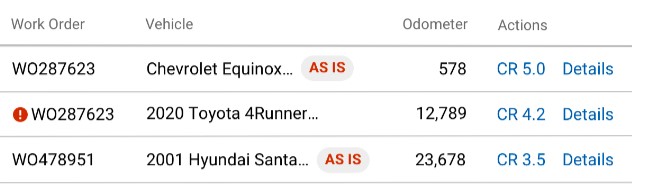
Cells can contain text, icons, Indicators and cell-level-actions. Consider grouping actions to the right instead of sprinkling links in every column.
Data in the XS-S breakpoints is right-aligned by default and can be left-aligned.
Header Sorting States
Header cells have these states: not sortable, sortable, and sorted. In addition, a sortable header that is not the currently sorted column has a hover/tap state. These states can appear on any color header row. Click the Design tab at the top of this page to review view design details.
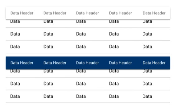
Table Header Sort States.
Usage Guidelines
To promote ease of scanning and understanding, follow these UX best practices:
Do
Keep heading labels short.
Use the default left-alignment in most cases.
Numbers of varying lengths should be right aligned (e.g. odometer, dollar amounts).
Data of the same length may be optionally center- or right-aligned (e.g. phone numbers, VINs, state abbreviations, icons)
Avoid scattering interactive elements in tables. Group interactive elements in the right column as much as possible to reduce motor activity and provide consistency between tables. Actions in the right column will reflow above data groups in the XS-S breakpoints.
Don't
Avoid long column labels.
Avoid scattering interactive elements in differen columns
Avoid left-aligning numbers in the most cases.
Code
Basic Table
The most simplistic column is a string. Rows will be keyed to the value of the column.
Basic Header set
More common, the columns will need more data to describe happening in the column
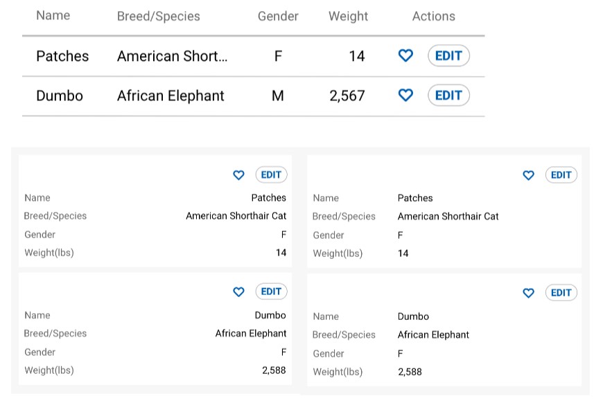
Responsive Table
A responsive table will take the Header and align it to the left with the value to the right on small screens.
Table Header Styles
Table headers have three (3) distinctly different look options other than the uncolored default.
Light
Dark
Color
Condensed Table
Adding the condensed prop will reduce
Contained Table
A table can be wrapped in a container if the contain prop or isScrollable
prop are present with the width value set to the default value (100%). To set an
alternative width or height, use the width and height property. The use of
width and height without contain or isScrollable will apply the
dimensions to the Table component.
Sticky Header
In long tables, when compaired to the viewport or the contained height, it may
be desirable to maintain the visial presence of the header. Do so with the
headerSticky prop.
Sortable Table
Columns can be sorted by adding the sortable key to the column.
By default, the first columns with a sortable key is selected to be sorted.
To specify which column to be sorted, specify it with the sortBy prop. sortBy
contains two keys: id and desc (optional). Note: A column can be sorted
initially regardless of the sortable key in the column.
No-Reset Mode with External Data
It is recommended that any mutation to data be done through the actions API described below. In cases where you want to mutate data from a parent component but maintain pagination state, you can disabled some of the recommended reset behavior with the skipReset prop.
Table with Actions
Table actions are denoted with the className table-actions in the column. To
provide custom content to the cell, provide a custom formatter component to the
Cell key. In an application, this can be a defined component where many props
are passed to the function.
Table with Single Sort
Adding the singleSort prop will move the sort mechanics to the SingleSort
component and remove the ability to sorting from the table headers.
Table with Pagination
Pagination is able to be turned on simply by providing the pagination prop.
To specify the initial page, page size, or page sizes available, provide an
object with the keys: pageIndex, pageSize, pageSizes. The page sizes label
defaults to Results per page and can be modified by providing a label key to
the pagination object.
Table with Expanded Row
To create a row with expanded content, simply provide an expandedRow attribute
to the corresponding entry in data with the expanded content as the value.
Props
| Name | Type | Default | Description |
|---|---|---|---|
| caption | `[string | node | nodes]` |
| columns | [string \| obj] | [] | Used to provide headers and column modeling |
| condensed | bool | false | Reduces the vertical height of the data table |
| contain | bool | false | Wraps the data table in a visible container. Used for scrolling tables as well. |
| data | [obj] | [] | Data associated with column selectors or used in formatting the column content. |
| footer | object | null | Configuration props which are passed to a footer element. For renderable values, use the children key. |
| headerStyle | string | Options: light, dark, color | |
| headerSticky | bool | false | Pins the data table header cells to the top of the data table container or viewport. |
| height | [number\|string] | Determines the height of the viewable table when placed in a container or is scrollable | |
| manualSortBy | bool | false | Enables sorting detection functionality, but does not automatically perform row sorting. Turn this on if you wish to implement your own sorting outside of the table (eg. server-side or manual row grouping/nesting) |
| onBeforeSort | function | null | Callback fired before sort logic is triggered |
| onAfterSort | function | null | Callback fired after sort logic is triggered |
| pagination | [bool\|object] | Providing the prop will display the default settings for the pagination and results per page sections. Object keys will override default values | |
| pagination.label | string | Results per page | Changes the label |
| pagination.pageIndex | number | 0 | Changes the current page displayed. Zero indexed |
| pagination.pageSize | number | 25 | Changes the number of rows per page |
| pagination.pageSizes | [number] | [25, 50, 100 ] | Changes the options in the button group for the results per page |
| responsive | bool | false | Allows the table to reflow in smaller screens |
| scrollable | bool | false | Enables a scrolling table |
| skipReset | bool | false | If true, will disables some default behaviors in favor of more control from parent via props. This is useful when updating data externally. May cause unintended behavior if used incorrectly. |
| singleSort | bool | false | Will turn off the header sort mechanics in favor of the Single Sort component |
| sortable | bool | false | Enable sorting for all columns. Can be overridden by each column separately. |
| sortBy | object | Establishes default rules for sorting a column | |
| sortBy.id | string | The accessor for the column that is to be sorted. | |
| sortBy.desc | bool | false | Specifies if the target column ought to be sorted ascending (false, default) or descending (true). |
| width | [number\|string] | Determines the width of the viewable table when placed in a container or is scrollable |