Slideout
Usage
Like a modal window, a slide out panel is a child “window” which appears in front of the main content. They are an effective way to show and hide content that is only needed for short interactions.
Common Characteristics
All slide out panels appear on a 50% opacity black background by quickly sliding into view from the left or right side of the main window. Animation timing is preset to slide-in 250ms and slide out 200ms. They always have a heading, and a close function, plus additional content and controls. All slide out panels are the full height of the window, and width varies (see below).
While visible a slide out panel prevents the user from interacting with the main page. A user may close a slide out panel by clicking on the main window, or keyboard ESC, or “X”, or an action button.
Usage Guidelines
Slide out panels should be used for content that is only needed occasionally and should only be displayed at the user’s request. Use slide out panels instead of modal windows for complex interactions like long forms, or filters, or navigation menus.
Width
The width of a slide panel is not defined in order to allow designers to specify the width needed by the content in the design. It is recommended to specify the maximum width needed by number of columns or percent of screen, and the minimum width by pixels.
At the XS breakpoint, the slide out panel covers the full screen width.
Interaction
When a slide out panel is open, all functionality on the main window should be disabled including scrolling.
When the content of the slide out panel requires scrolling, any submit/cancel buttons should be locked to the bottom of the panel to remain visible.
Accessibility
Allow the user to dismiss a slide out panel using the keyboard's ESC key, or by clicking the main window, or by clicking close (“X”).
Design
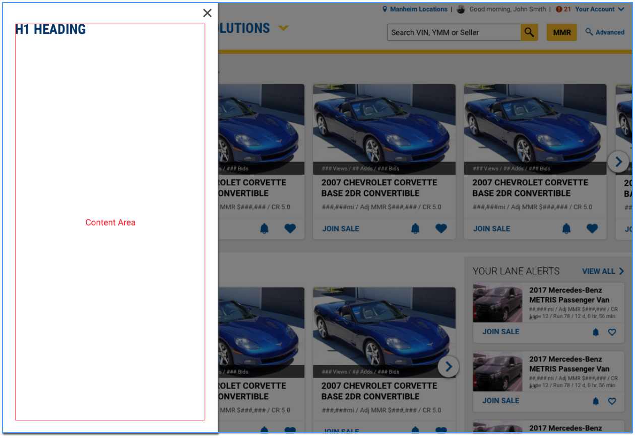
SlideOut from left
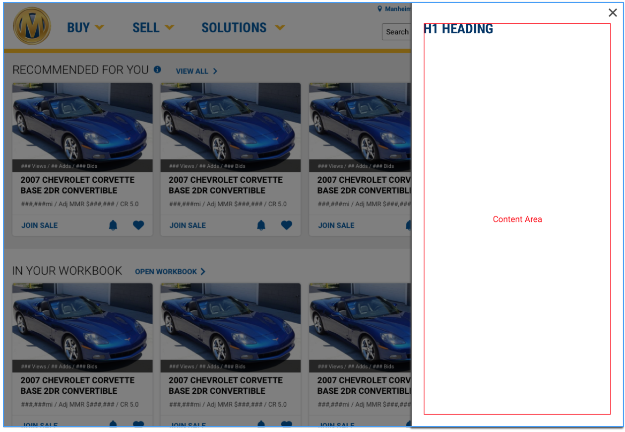
SlideOut from Right
Code
Default SlideOut
The default slide out appears from the left
SlideOut from Left
SlideOut from Right
SlideOut with maximum width
SlideOut with fixed width
The Slide Out width is meant to be determined by its content.
The maxWidth prop is recommended to specify the width of a slideout that should not take up the full view width.
However, a fixed with can be added to the slideout content by manually setting the styled width.
The defined content width must be in either px, em, rem, or vw, but cannot be percentage(%) based. The width of the Slide Out can also be managed in CSS by targeting the .slide-out-body class.
Actionable SlideOut with custom trigger
The actionable prop gives up control of the inital open state to the SlideOut component's open prop, allowing for customization.
Props
| Name | Type | Default | Description |
|---|---|---|---|
| actionable | boolean | false | Gives up control of the SlideOut component’s open state to the open prop, allowing for customization. If this is true, onCloseButtonClick must also be defined. |
| headerText | string | undefined | Sets the text for an h1 header element displayed in the slideout |
| maxWidth | string | undefined | Sets the maximum styled width for the slideout |
| onCloseButtonClick | function | () => {} | Sets the function called when the close button is clicked in an actionable slideout |
| open | boolean | false | Sets the initial open state for the slideout. For actionable slideout, controls the open state. |
| placement | string | "left" | Sets whether the slideout slides in from the left or the right |
| triggerClassName | string | "btn btn-outline" | Sets the class name on the slideout trigger element |
| triggerHref | string | undefined | Sets the href for the slideout trigger element |
| triggerTag | string | "button" | Sets the tag type for the slideout trigger element |
| triggerText | string | undefined | Sets the text for the slideout trigger element |